
The Jewish Museum sits on a stretch of Fifth Avenue in New York that once served as the front lines of a quiet arms race of limestone and ego. This building won by going full French Gothic château, complete with steep rooflines, carved detail, and a sniffy attitude. Built in 1908 for Felix and Frieda Warburg, it’s now home to a museum that is nothing like a traditional house museum, which is probably for the best.
At its core, the museum is an art museum focused on Jewish life. There is a permanent collection—large, serious, and mostly out of sight—but the real action is in the rotating exhibitions. The museum runs on them. Shows come and go, each one taking a different angle on Jewish history, identity, and culture, using art as the common language, whether the subject is biblical, political, or somewhere in between.
That approach keeps the place from becoming predictable. During our visit, one gallery featured stories from the Book of Esther as interpreted by Dutch Golden Age artists, while another presented works covering 20th-century protest, labor, and civil rights. Shows at the museum don’t follow a clean timeline so much as circle the same question—what it means to be Jewish, and how those ideas get expressed, reworked, and occasionally argued with.
It feels like dropping into the middle of a conversation and being expected to keep up.
The Book of Esther in the Age of Rembrandt
The Book of Esther has been presented through art for millennia. But it took on new meaning in 17th-century Holland. Artists in the orbit of Rembrandt van Rijn treated it more as a soap opera than a biblical story—with royal intrigue, hidden identities, and a well-timed reversal. It became a subject that could carry something extra, shaped by a market that now included Jewish patrons and a country that liked seeing its own story reflected back at it.
That shift had context. Amsterdam's Jewish communities lived with a level of openness that hadn't been possible in much of Europe, and Dutch artists were responding to current interests as much as to religious tradition. For Jewish viewers, the story carried obvious messages about deliverance, survival, and continuity. For Dutch audiences more broadly, it could also read as a story about politics and national identity. The result is a body of work that reflects both the story itself and the moment in which it was painted.

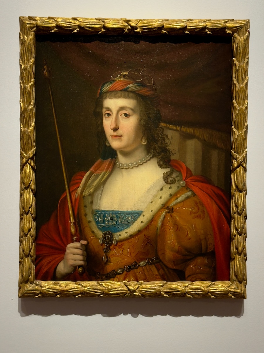
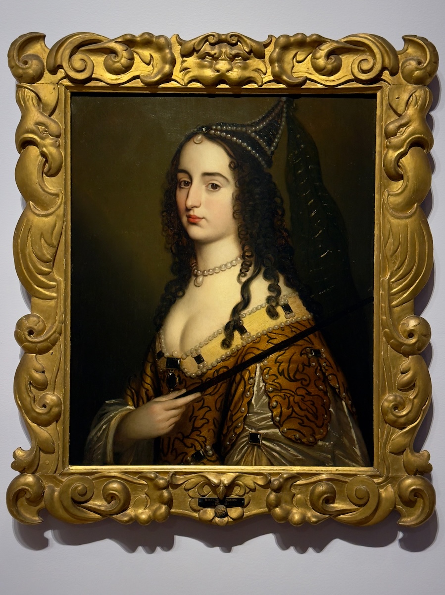
Portrait of a Woman (possibly Amalia van Solms as Esther), 1633; Elizabeth Stuart as Esther, c. 1632; Princess Elizabeth, Princess Royal, c. 1630–56 – Gerrit van Honthorst
Three Protestant royal women recast as Esther, each using the story to say something about their own situation. Amalia van Solms had already been publicly praised as a “new Esther,” while Elizabeth Stuart and her daughter were living in exile after losing the Bohemian crown. The costumes do some of the work—crowns, veils, that slightly Persian look—but the point lands without them. Esther becomes a role you can step into, not just a figure from the past.
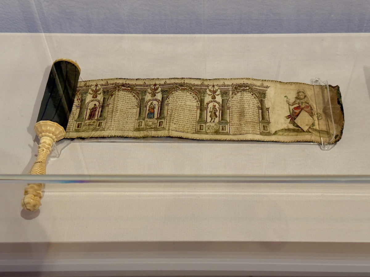
Esther Scroll (Megillah), 1640s – Salom Italia
This is the story in its original format—meant to be read aloud during Purim, not hung on a wall. Italia turns it into something more visual, breaking the text into scenes and framing it with illustration. The blank cartouche wasn’t a mistake—it was an invitation. Buyers could personalize the scroll, which makes this feel less like a fixed object and more like something meant to move through people’s lives.

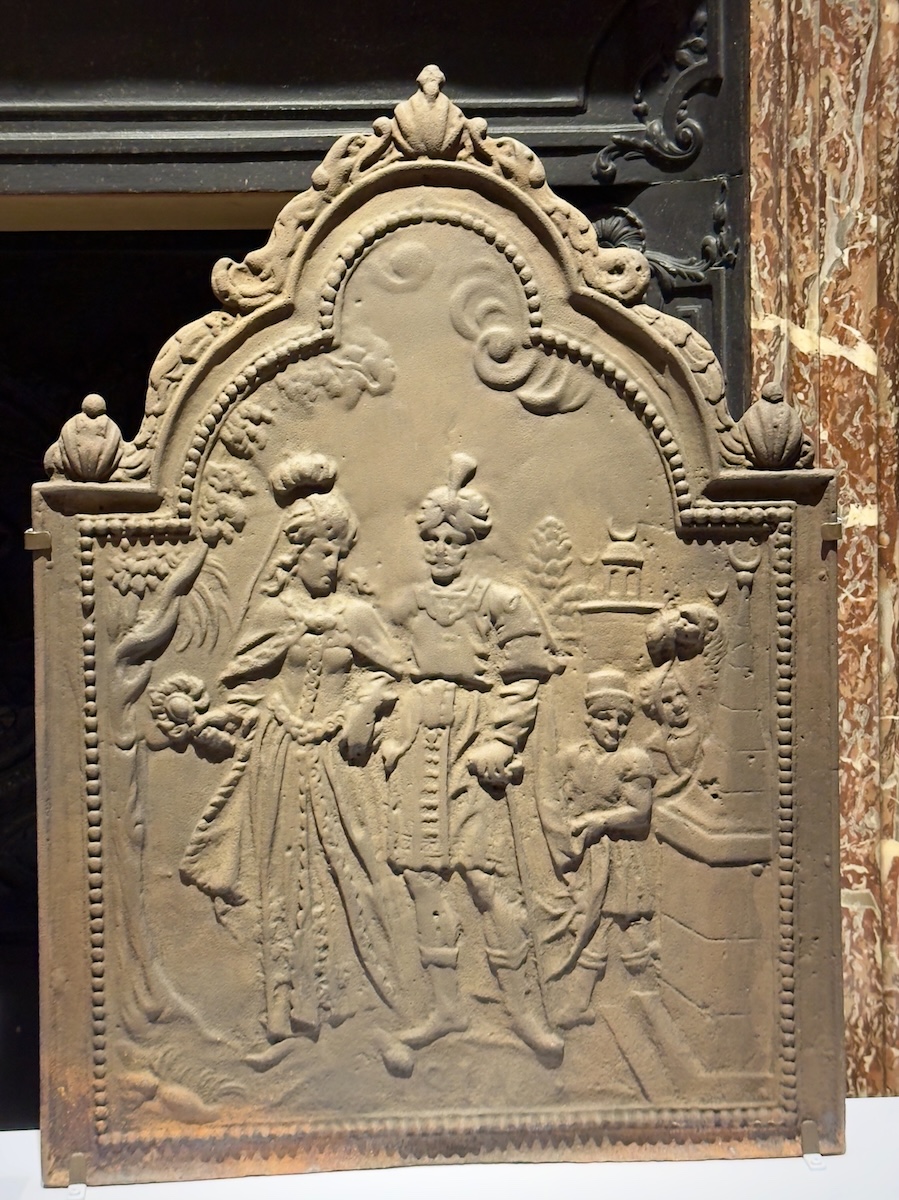
Firebacks with Esther before Ahasuerus, 1640–59 – Unknown
These weren’t made for galleries. Firebacks sat inside working fireplaces, protecting the wall and reflecting heat back into the room. Here, they carry two scenes from Esther’s story—marriage and intercession—turned into something you’d see every day. The story shifts slightly in the process, making it less about creating drama and more about setting an example. Esther becomes less a figure in a narrative and more a model of behavior, quietly installed in the home.
Mordecai Listening to the Conspiracy of Ahasuerus’s Chamberlains, 1629–48 – Willem de Poorter
The entire scene depends on you noticing what’s happening in the shadows. Two figures lean in close, whispering through the plot, while Mordecai sits just far enough back to overhear. The lighting does most of the storytelling—bright where the danger is, dim where the consequence is forming.
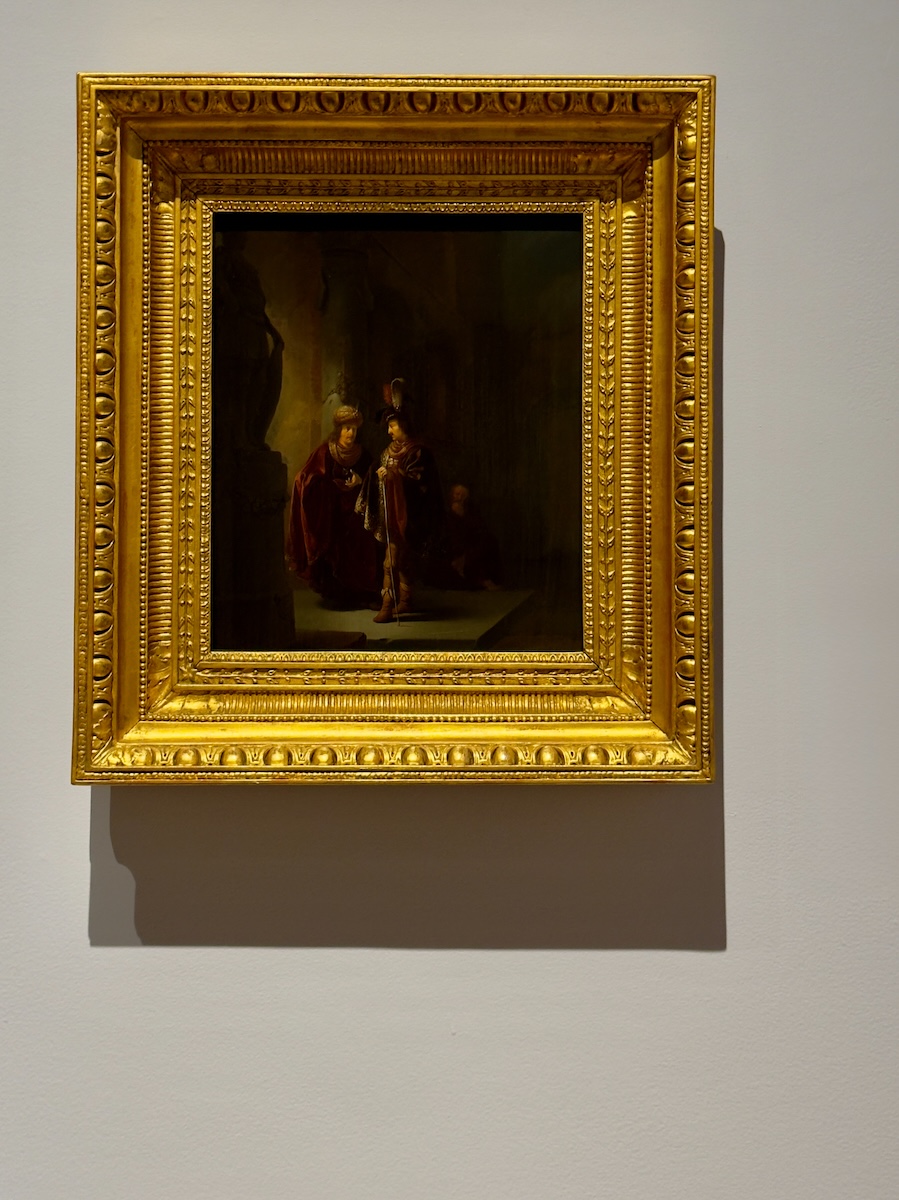

Esther and Mordecai, 1616 – Hendrick van Steenwijk the Younger
A quieter moment, but not a small one. Mordecai takes Esther's hand and pushes her toward action, knowing exactly what it could cost her. The setting feels almost out of place—more church than Persian court—which was typical of the time. The story is relocated to a familiar setting, so the stakes don’t feel distant.
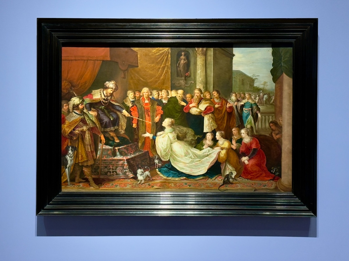
Esther before Ahasuerus, 1622 – Frans Francken the Younger
This is the moment where everything could end badly. Esther drops to her knees, moving faster than the rest of the painting can keep up with, while Ahasuerus decides whether she lives or dies. The extended scepter settles it, but not before the scene stretches out the suspense as much as possible.


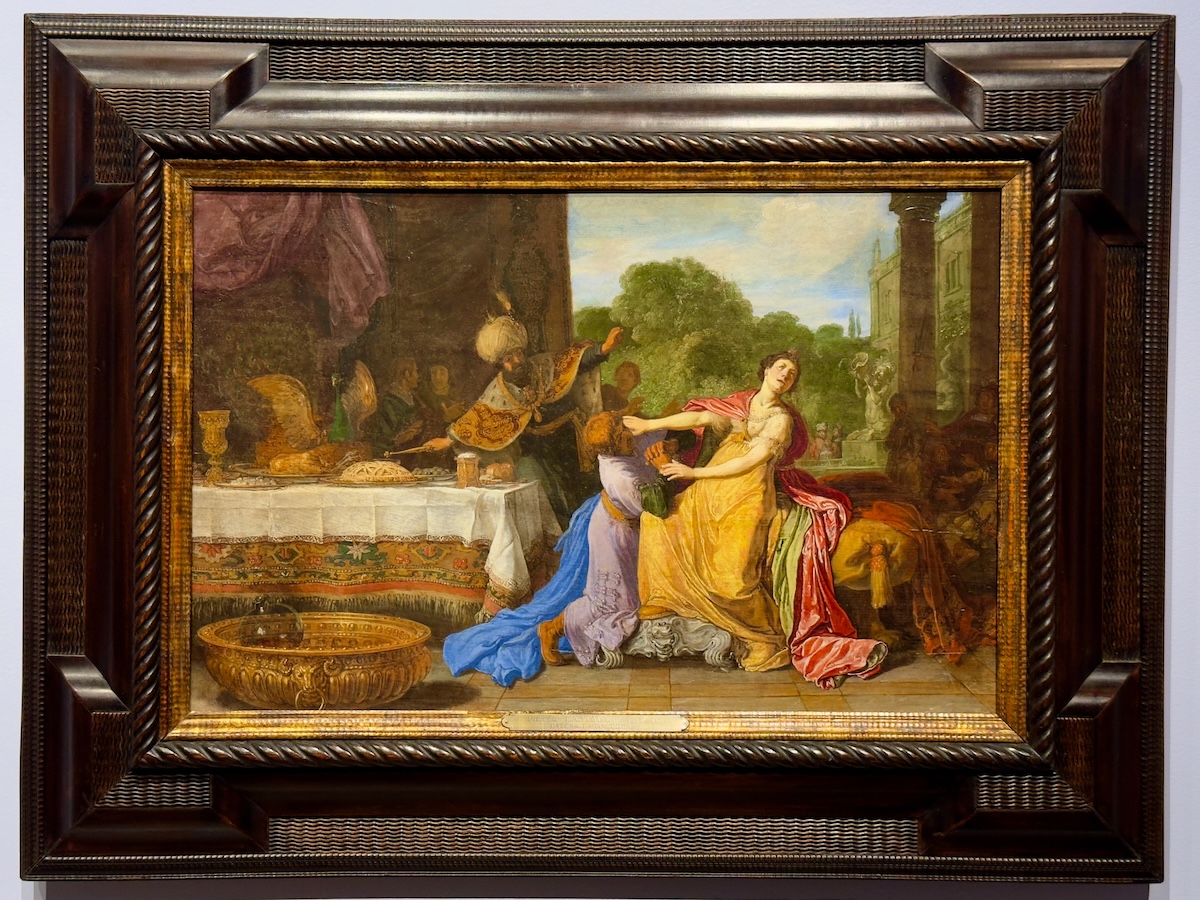
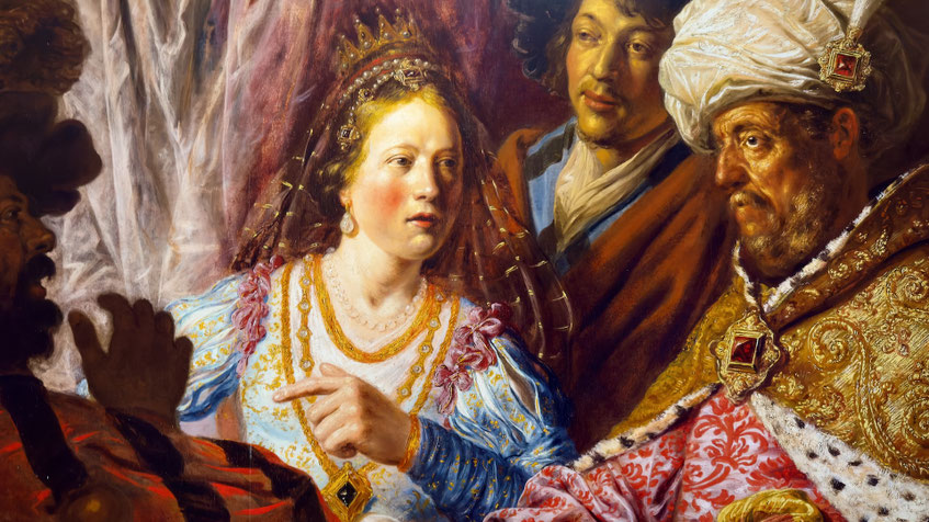
Haman Begging the Mercy of Esther, 1618 or 1619 – Pieter Lastman
The reversal happens fast. After Esther reveals Haman's plot, the king storms out. Haman falls toward Esther, begging for his life, just as Ahasuerus returns and assumes the worst—that Haman is attacking her. That misunderstanding seals it. Lastman loads the table with detail—Dutch food, fine linens, a setting that looks almost domestic—which makes the sudden power shift feel even more abrupt.
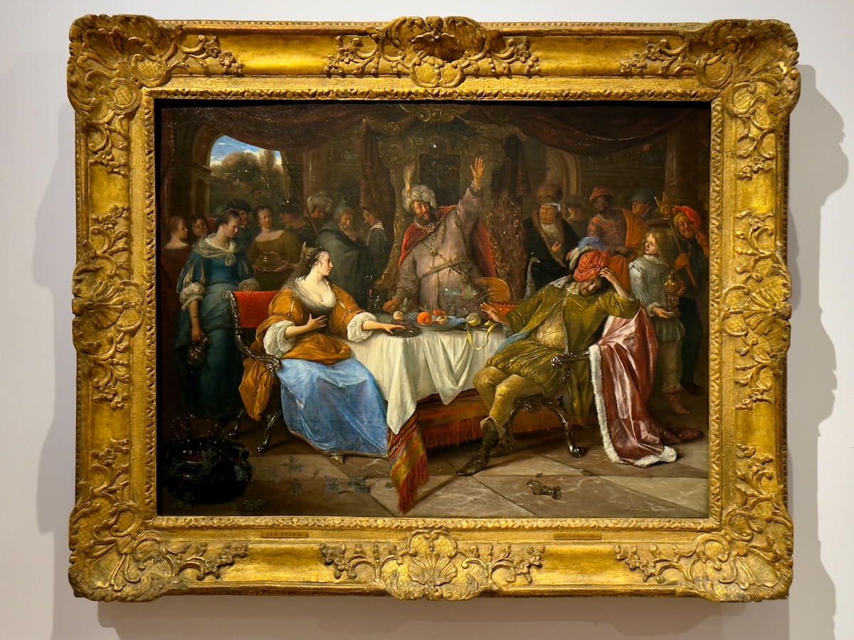
Esther, Ahasuerus, and Haman, c. 1668 – Jan Steen
By the time Steen gets to it, the story has loosened. The scene turns more animated, almost crowded, with reactions unfolding across the room rather than focusing on a single decisive moment. It feels less like the aftermath when everyone is trying to catch up to what just happened.
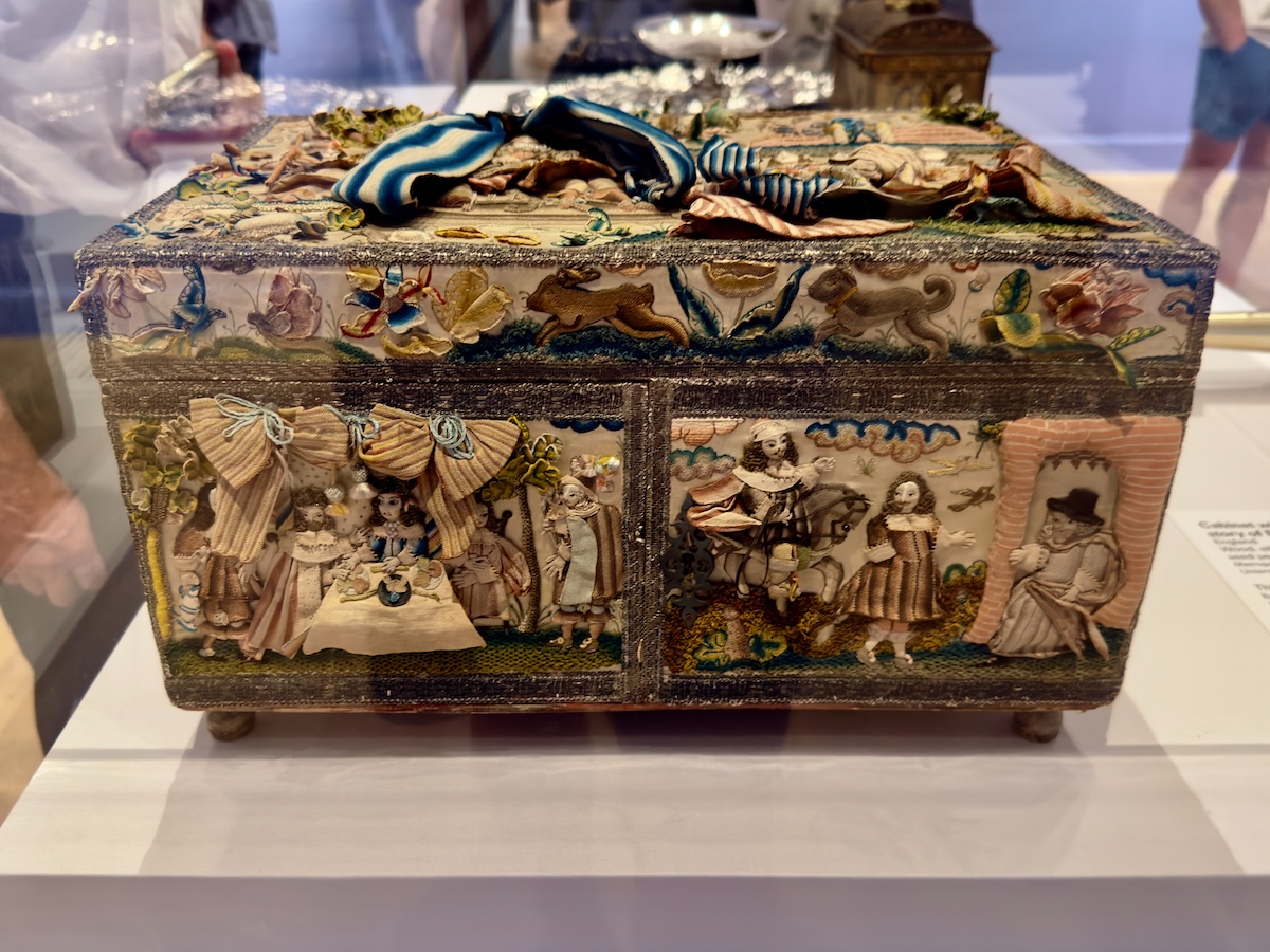
Decorated Casket (Esther imagery), undated – Unknown
This is the story fully absorbed into daily life. Scenes, symbols, and references stitched and arranged into something meant to sit on a table, be opened, handled, and kept. It doesn’t grab you like the paintings do. You have to get close. But once you do, it’s clear the same story has made the transition from canvas to object without losing its hold.
Ben Shahn: On Nonconformity
Ben Shahn’s work is much more modern but doesn’t ease up. This Shahn retrospective brought together decades of his painting, printmaking, photography, and design, all focused on the same set of concerns—labor, injustice, power, and the people caught in the middle. His early work leans into social realism, documenting the effects of the Great Depression and the lives it shaped, with a directness that leaves little room for interpretation.
His later pieces step away from straight documentation and get more symbolic and spiritual. The subject matter doesn't change as much as the way it’s handled. The same concerns are still there, just not spelled out so plainly.
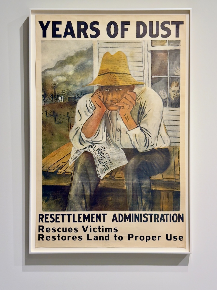
Years of Dust, c. 1930s
You don’t need much context here. A Depression-era farmer sits with the paper in his hands and nothing in it that’s any help. The kid in the window watches, somehow making it worse. It’s all laid out so plainly that it's hard to look away from.
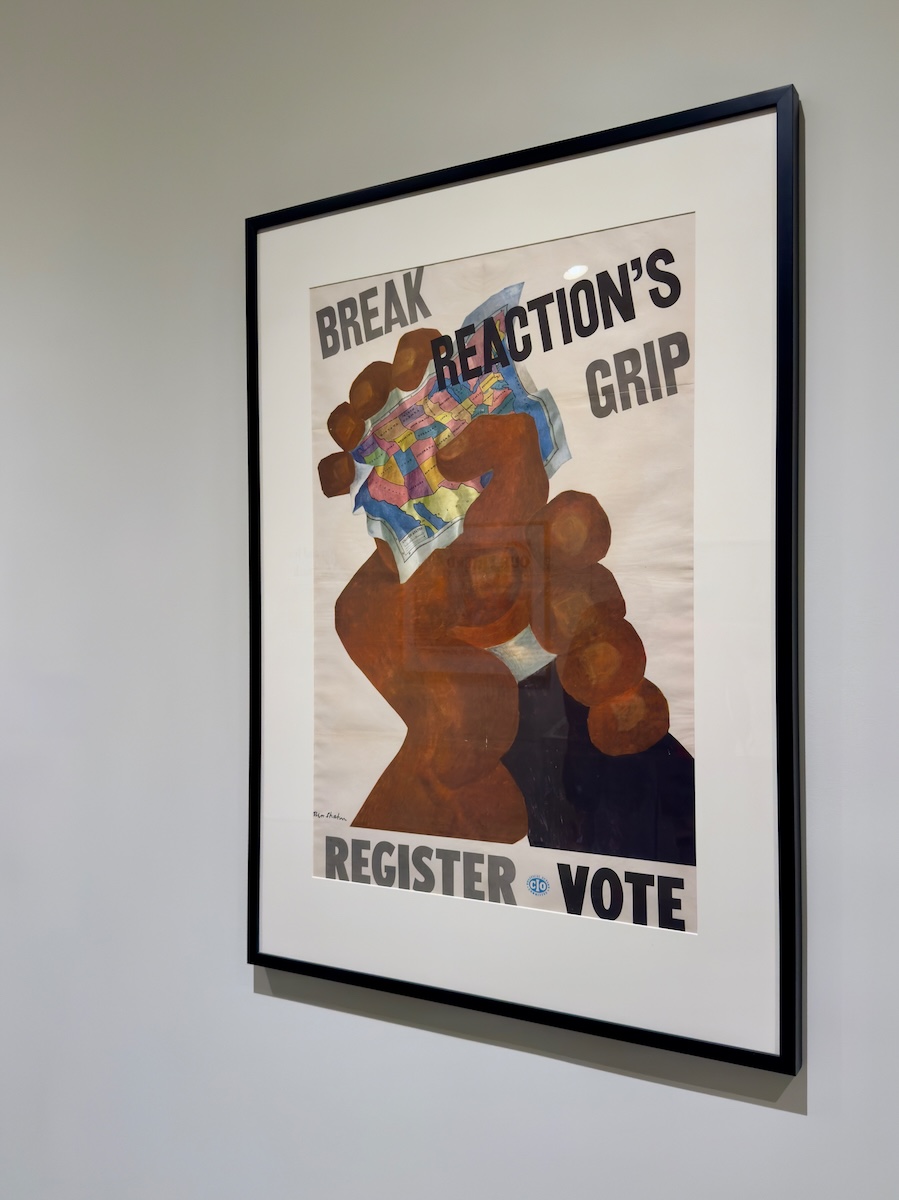
Break Reaction’s Grip, c. 1946
There’s nothing subtle about this one. A fist, a map, a command. It’s graphic, direct, and built to be understood in about two seconds. This was labor movement material, meant to be seen quickly, understood immediately, and acted on. The message isn’t complicated—and Shahn doesn’t pretend it is.

We Fight for a Free World, c. 1942
It looks like a wall you’d pass by without thinking twice about it—layered posters, half-seen, and easy to ignore. The posters list the charges—suppression, starvation, slavery—before landing on the slogan underneath. Shahn designed anti-fascist imagery during World War II, though not all of it made it into circulation. This one was rejected. The message is clear, but the delivery feels uneasy, with just enough friction to keep it from reading as simple propaganda.
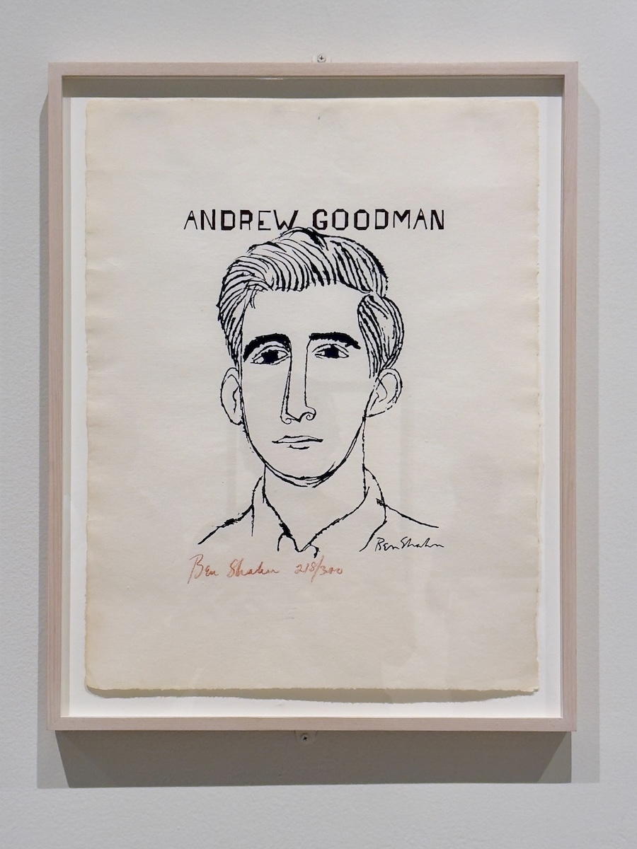
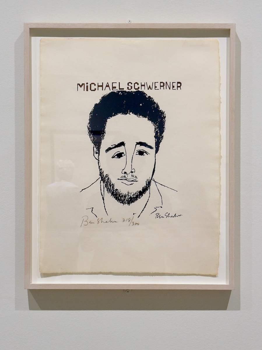
James Chaney, Andrew Goodman, and Michael Schwerner, c. 1964
Portraits of three civil rights workers murdered in Mississippi during the Freedom Summer of 1964, stripped down to the same spare lines, with the names doing most of the work. Shahn doesn’t dramatize any of it. No background, no narrative cues—just faces and identification. The simplicity does the work, and the context fills in the rest.

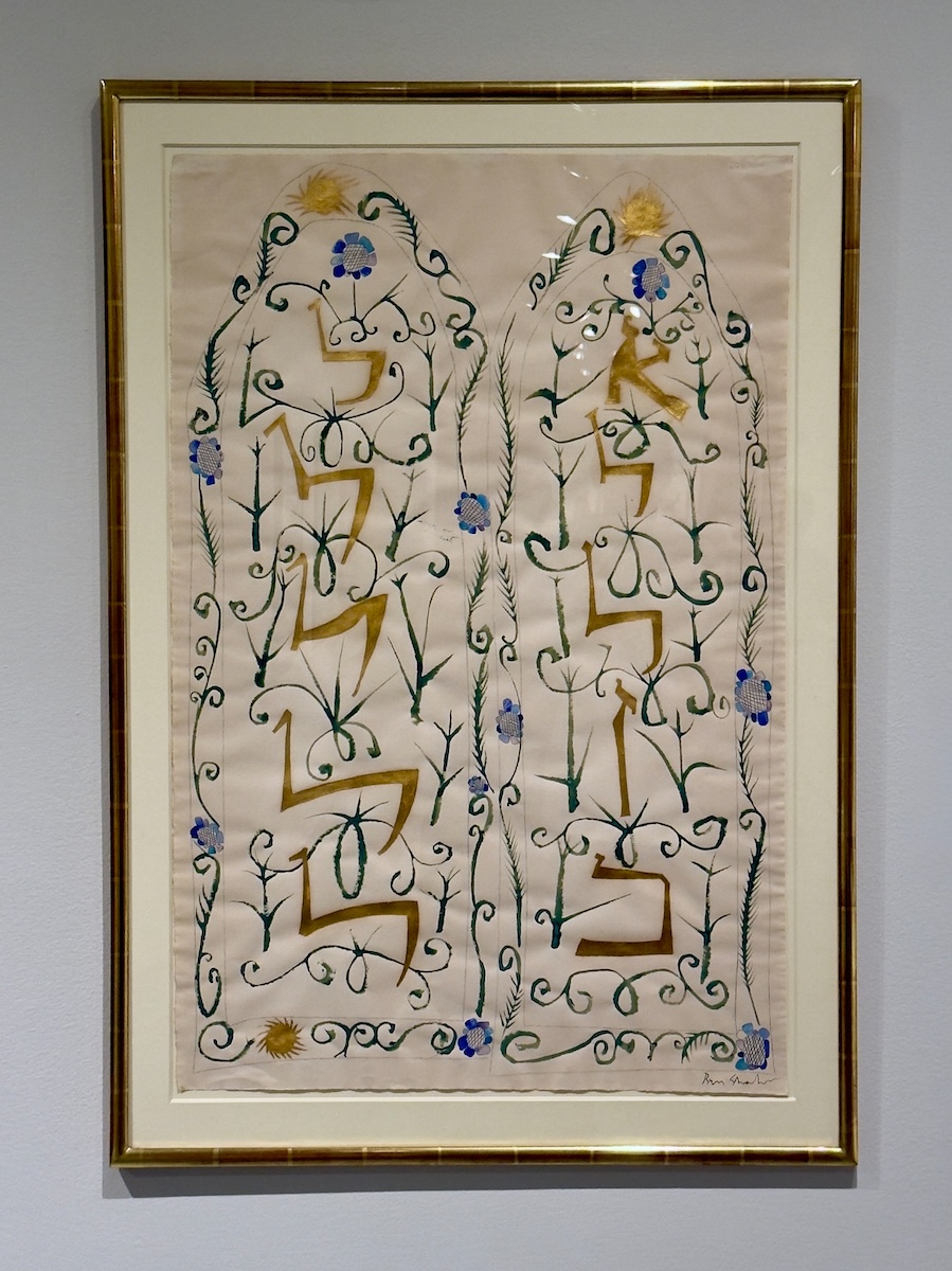
Hebrew Alphabet, c. 1950s
This one slows things down. The lines loosen, the tone softens, and the urgency gives way to something more reflective. Shahn often returned to Hebrew text, not as decoration but as a way to connect language, belief, and image without spelling everything out. It still carries meaning, just not in the same declarative way as the posters nearby.

Write a comment