
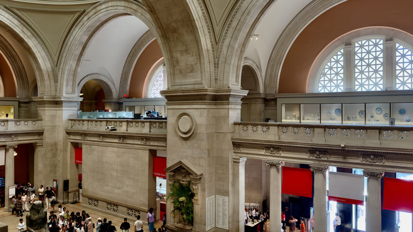
We walked into the Metropolitan Museum of Art with a solid attack plan and a high level of confidence, both of which lasted about 20 seconds after walking through the lobby.
You move through the Met in a steady drift, and rooms seem to blend into one another. The changes pile up without much ceremony—American murals, French interiors, mid-century sculptures, even the occasional commercial object that somehow made the cut. There is a system behind it all, but once you’re moving, you’re mostly responding to whatever happens to catch your eye.
This is our mixtape from that day. We're not art critics, obviously, so we don't have a framework for evaluating brushwork or placing things neatly into movements or eras. We just know what we like—usually for reasons we couldn't explain if we had to.
Highlights

The Shirt of the Emperor, Worn during His Execution, 1867 – François Aubert
A photograph tied to a moment we already knew well from time spent in Mexico. After Maximilian's execution in Querétaro, images like this circulated as proof, relics, and propaganda all at once. It's unsettling about how intimate it feels—the clothing of a man who, depending on your perspective, was either idealistic or deeply misguided, now reduced to something you’d find in an evidence locker.
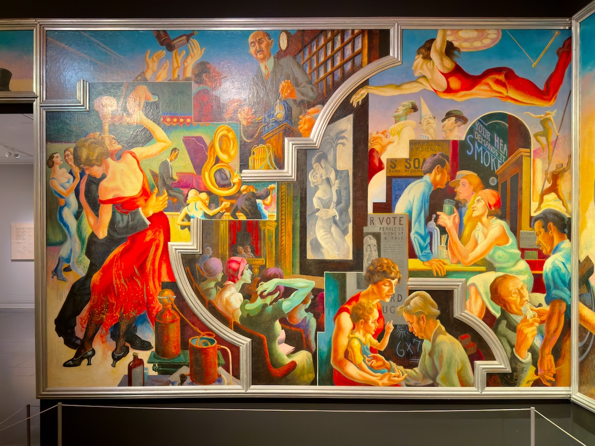
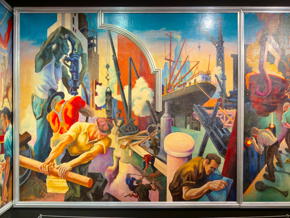
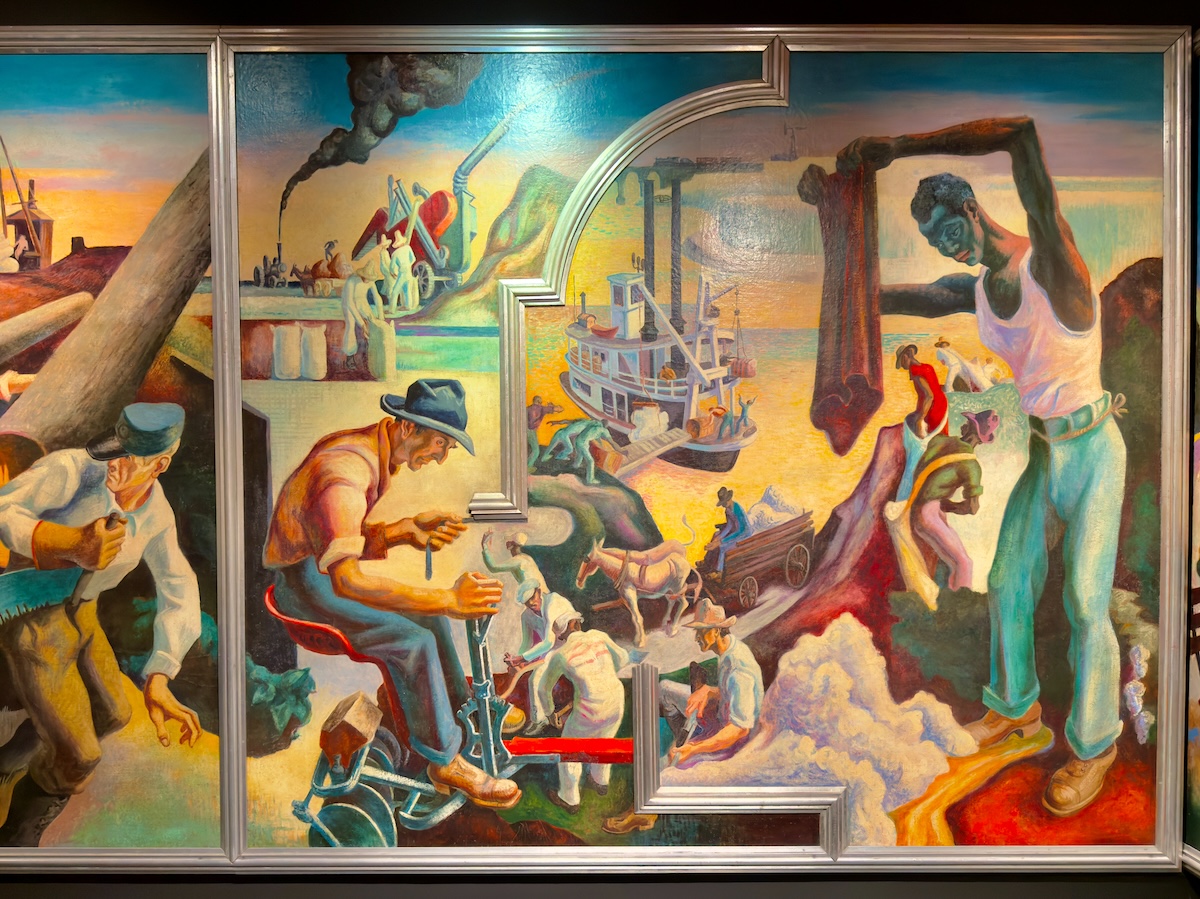
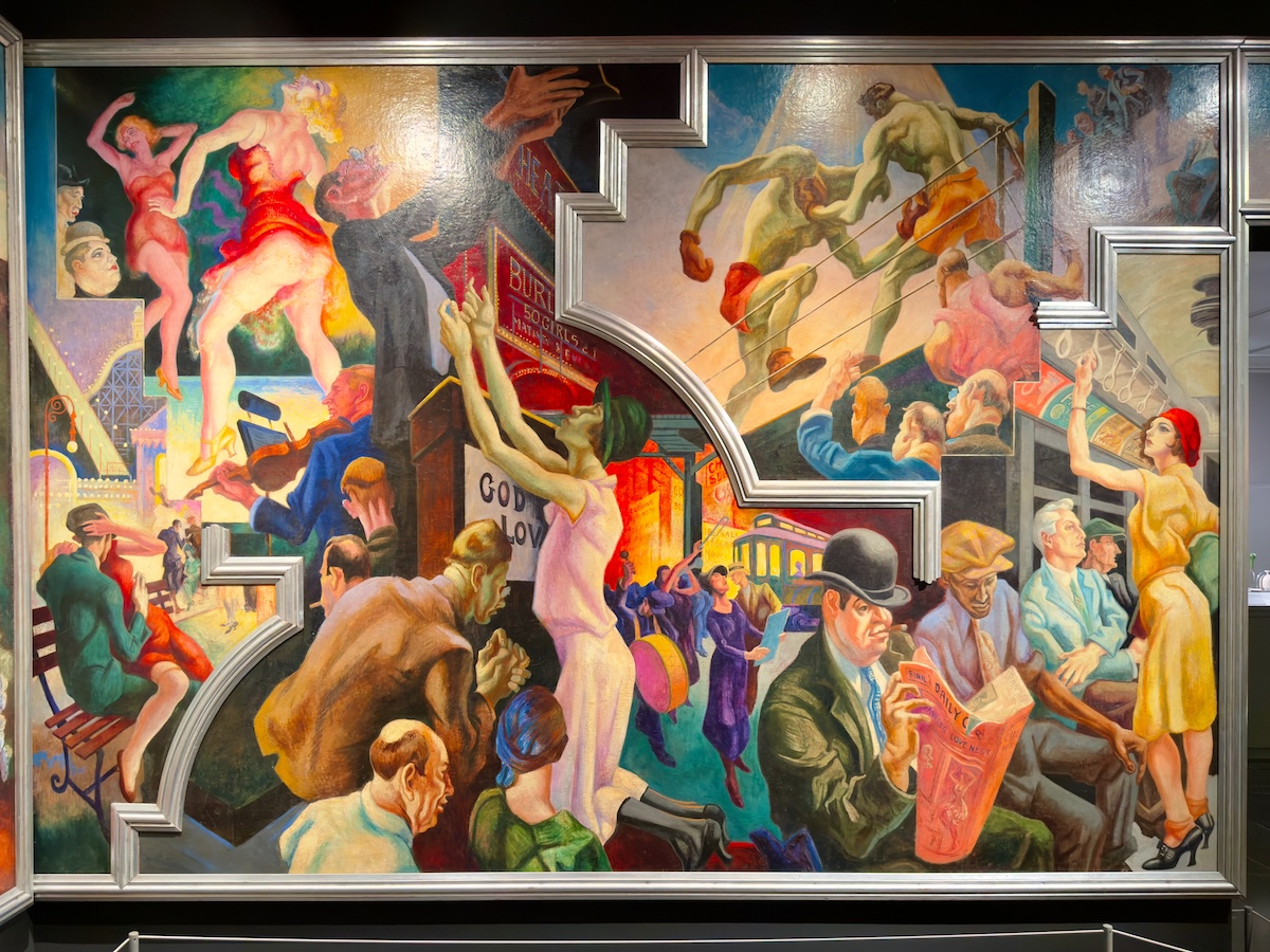
America Today, 1930–31 – Thomas Hart Benton
A room-sized sweep of American life between the wars—industry, labor, music, motion. Painted for a New School boardroom, which feels like an ambitious place to hang something this restless. The whole thing carries a kind of Deco-era confidence—muscular, busy, forward-looking—and unmistakably American in the way it leans hard on productivity, which is really all that matters here.


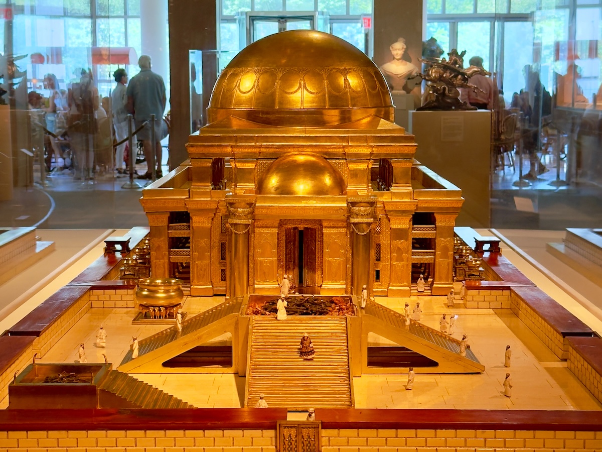
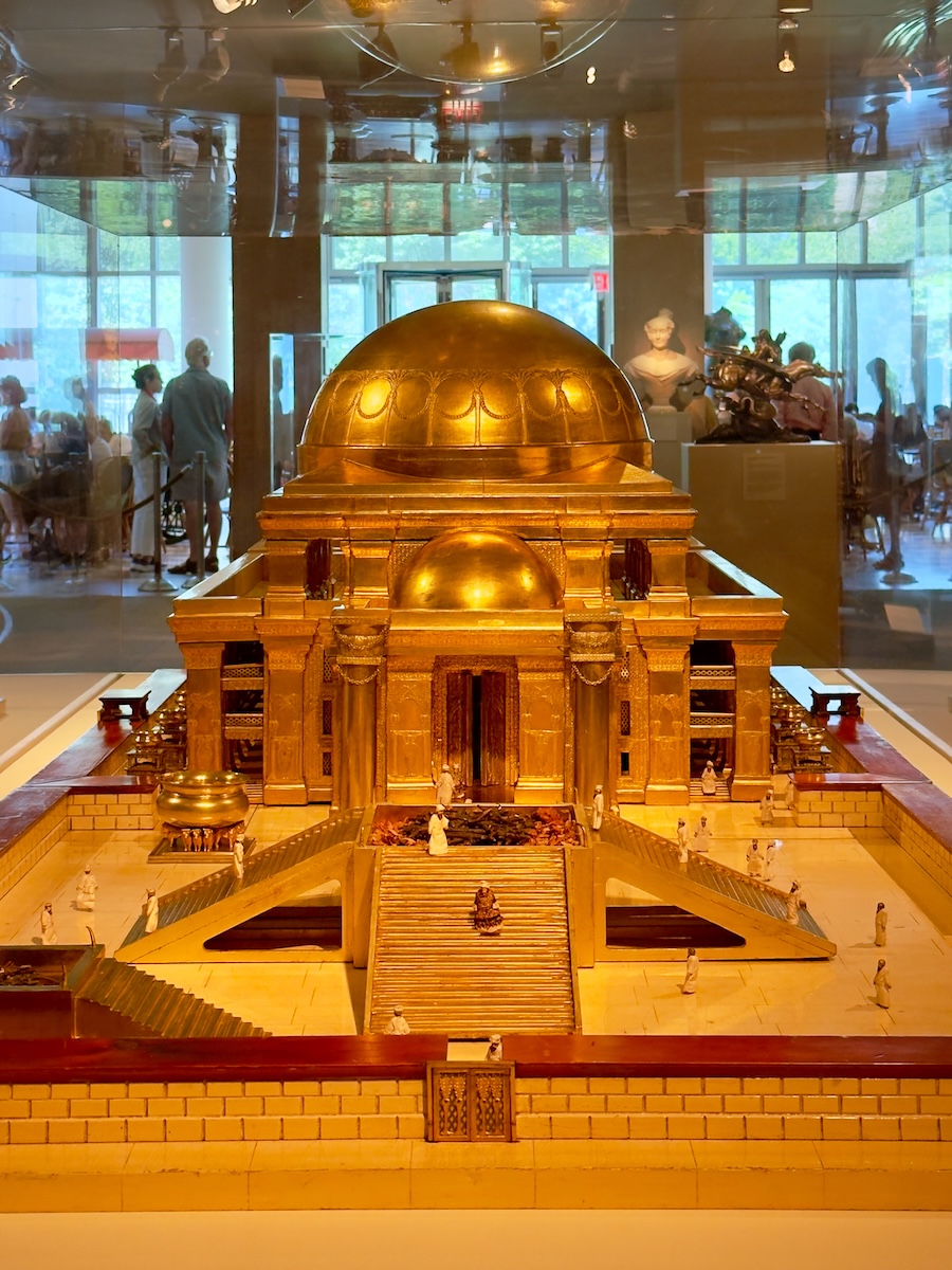
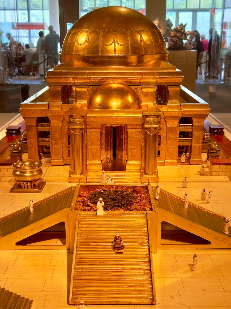

Architectural Model of King Solomon’s Temple in Jerusalem, 1883 – Thomas Newberry
A 19th-century attempt to build something that no longer exists, based largely on text and interpretation. The result is precise, elaborate, and quietly speculative. It feels like a faith made physical—every detail carefully reasoned, even where certainty runs out.
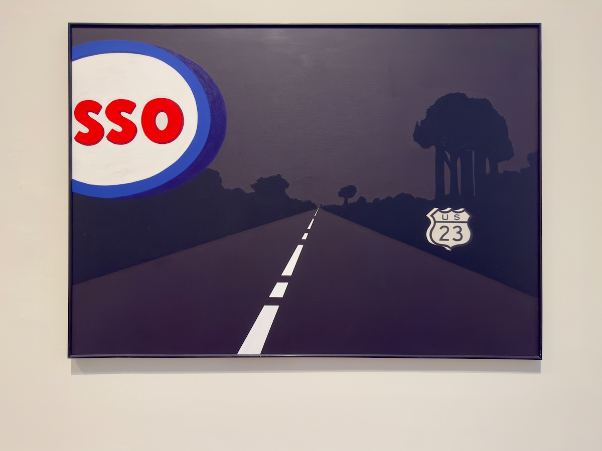
SSO, 1963 (reworked 1986–90) – Allan D’Arcangelo
A highway at night, a partial gas sign, and just enough detail to suggest where you are without confirming it. The missing letter is doing more than it seems—your brain fills it in automatically, turning SSO back into something your brain insists is familiar. It lands somewhere between painting and advertisement, built on recognition and just slightly off.
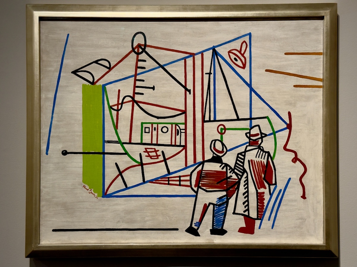
Men and Machine, 1934 – Stuart Davis
Two figures stand with their backs to us, looking at something being built. The structure is reduced to lines and color blocks, but the idea comes through clearly—industry as progress, and as performance. There’s a confidence to it, and also a distance. We’re watching them watch it.
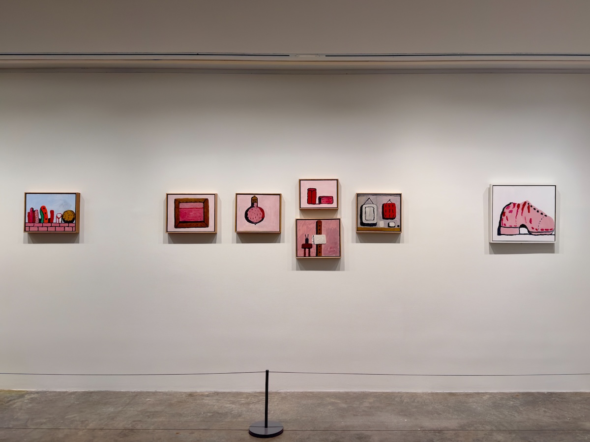
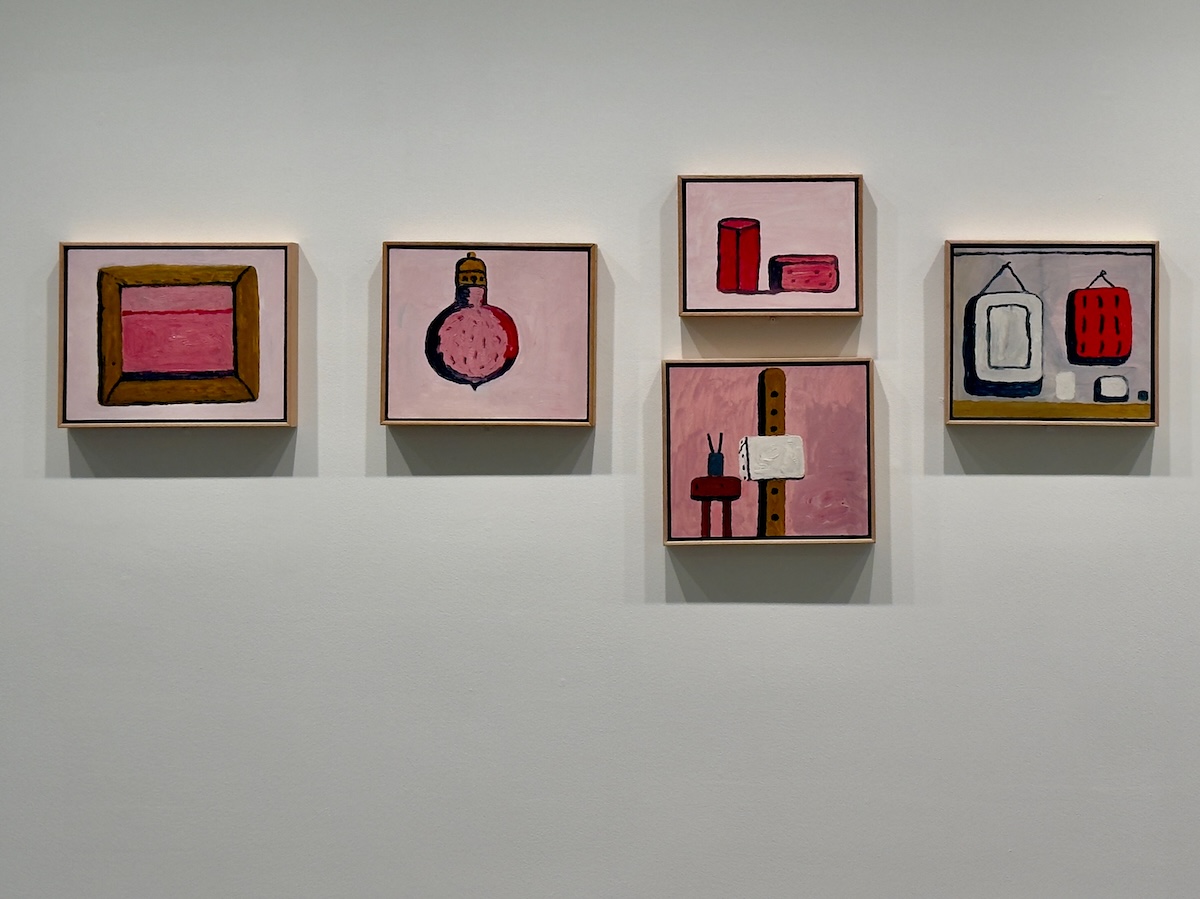
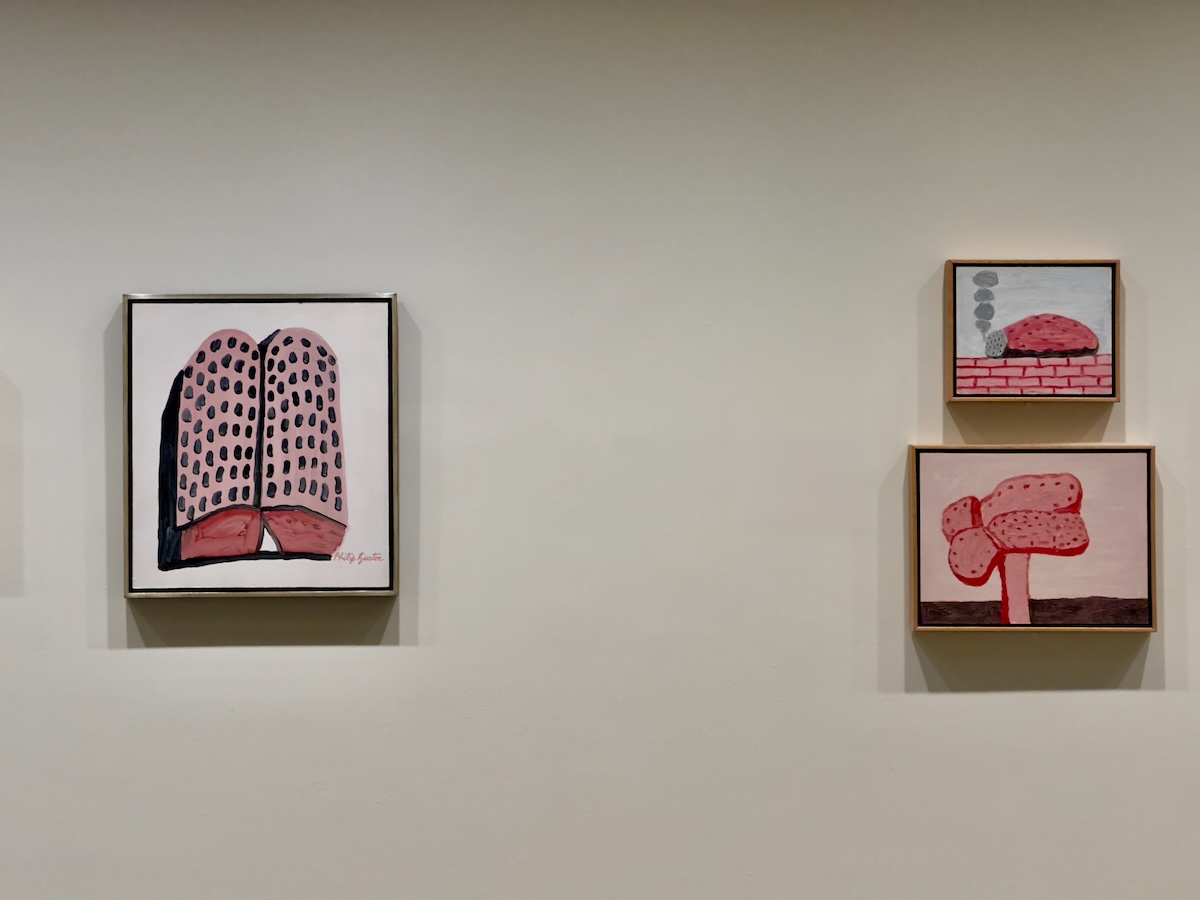
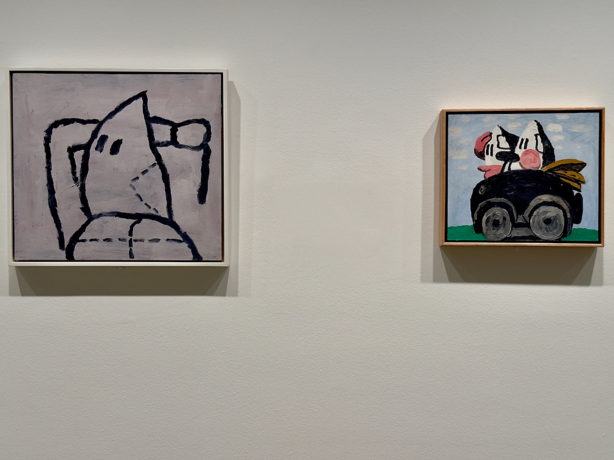
Untitled, 1968, and Untitled (Hoods in Car), 1969 – Philip Guston
Cartoonish figures in pointed hoods, placed in ordinary settings that don’t soften what they represent. The style lands somewhere close to comic-strip logic—simplified, almost casual—which makes the subject harder to shake. It’s racism rendered in a visual language that feels familiar, which only adds to the unease.

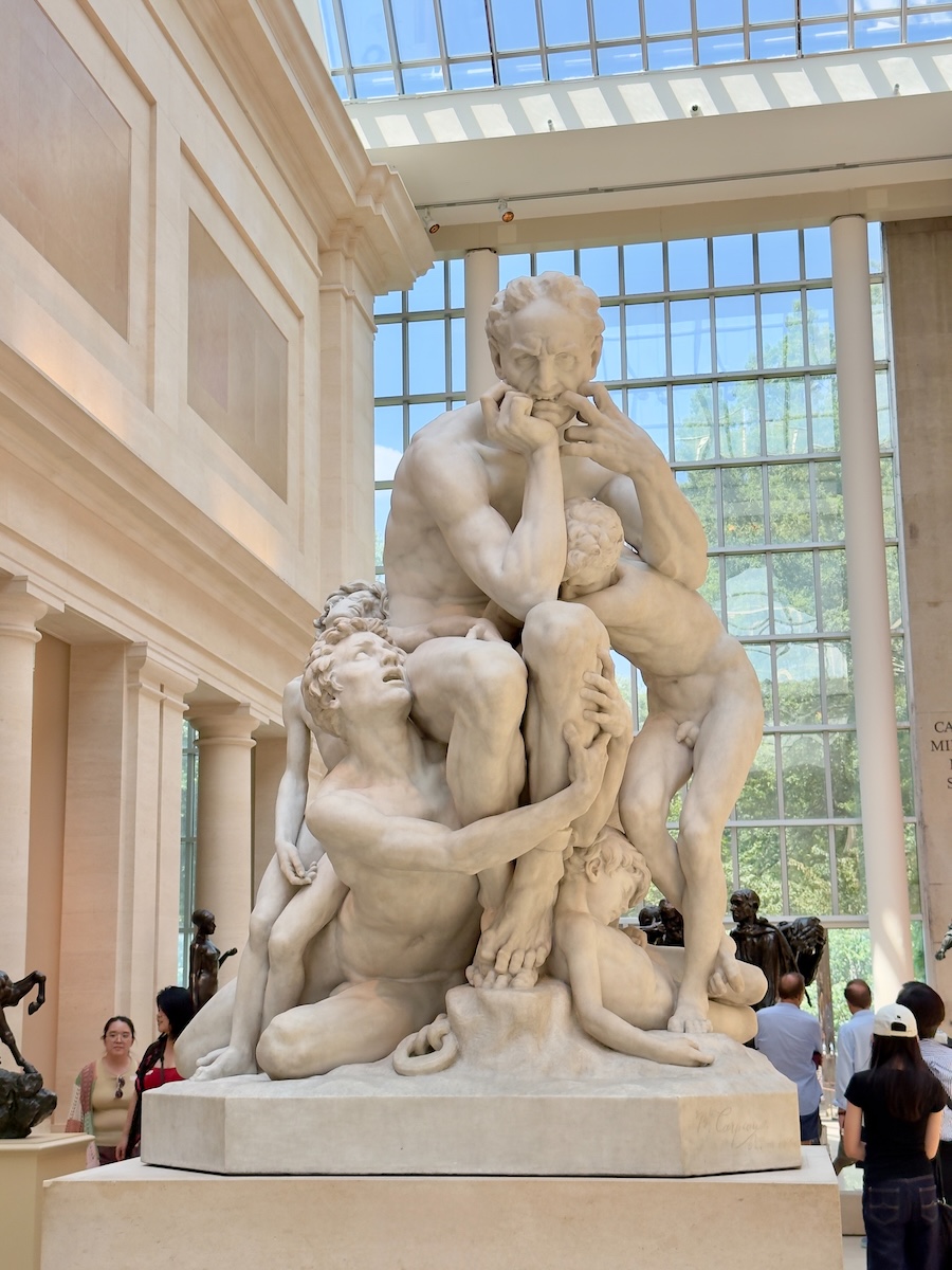
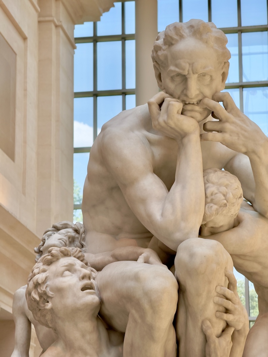
Ugolino and His Sons, 1865–67 – Jean-Baptiste Carpeaux
You see this one before you fully process it—the bodies knotted together, the strain in every limb, the expression that takes a second longer to register. The story behind it is grim, but the sculpture doesn’t need it. It carries that weight on its own, and once you notice it, it’s hard to look anywhere else in the room.
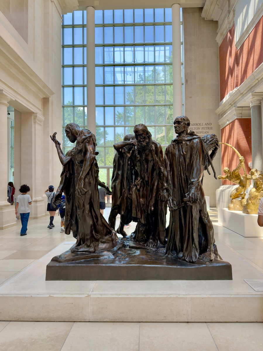
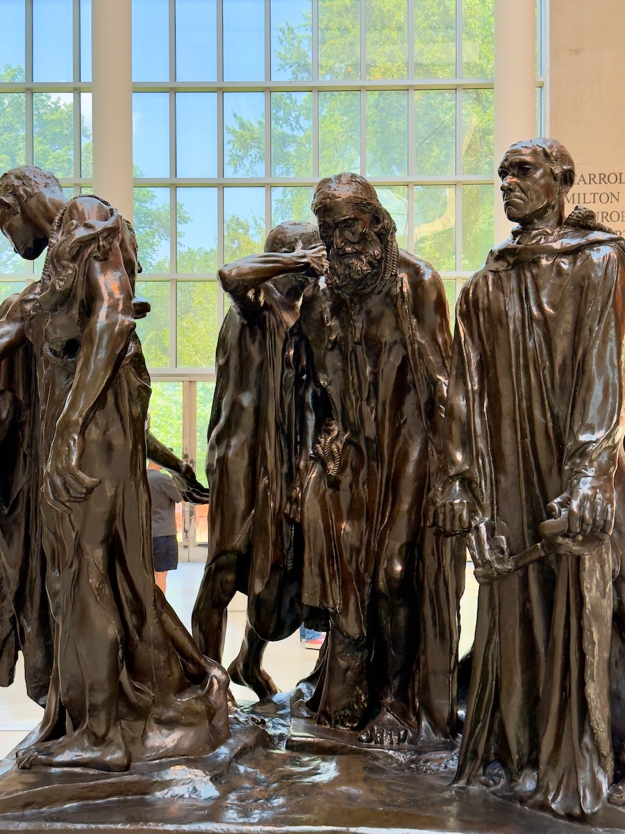
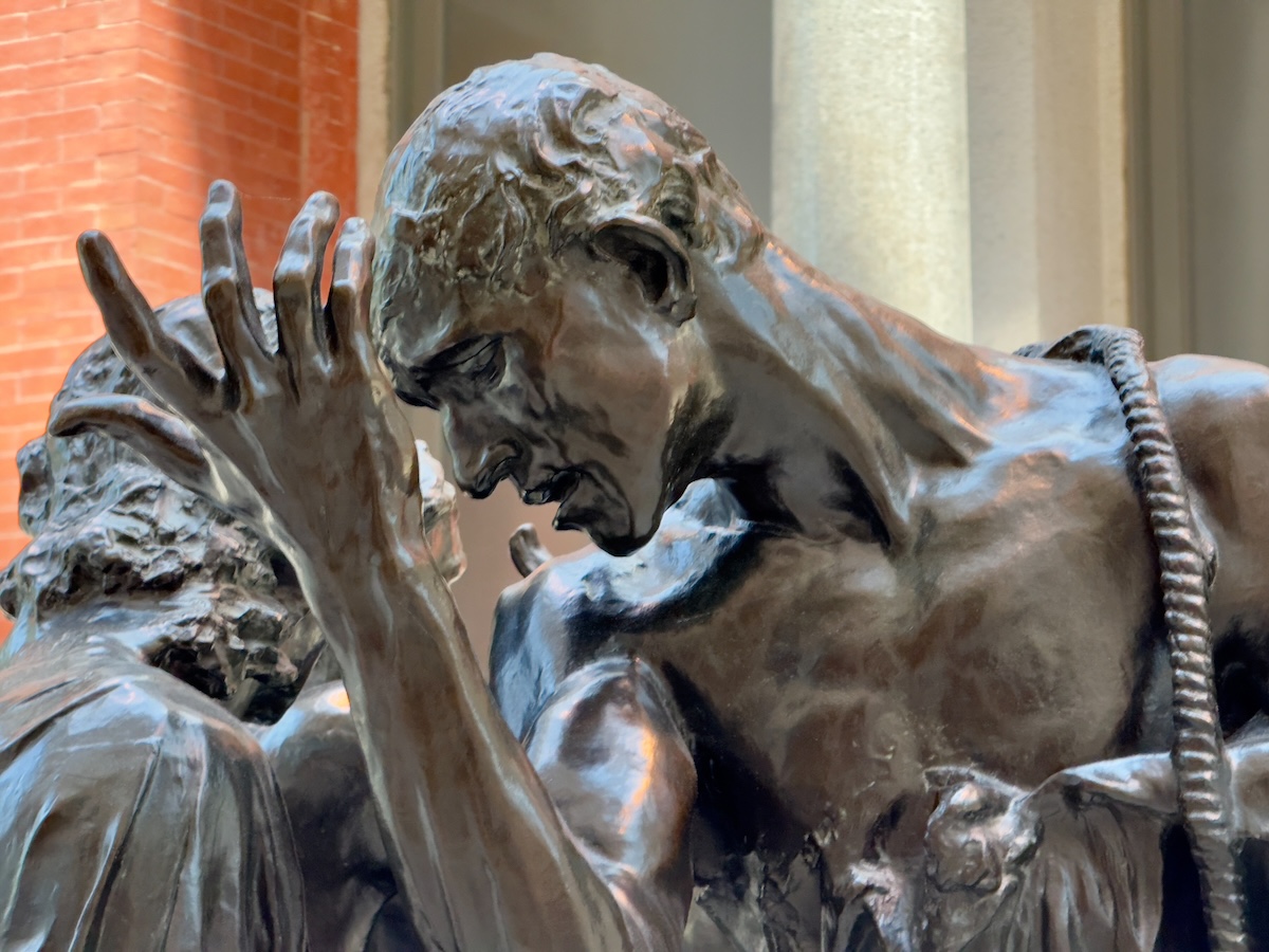
The Burghers of Calais, 1884–95 – Auguste Rodin
One of those pieces we always go looking for. The figures stand together, but not quite with each other—each one caught in his own moment, his own calculation. At ground level, they feel less like a monument and more like a group of people who’ve already said yes and are now sitting with what that actually means.

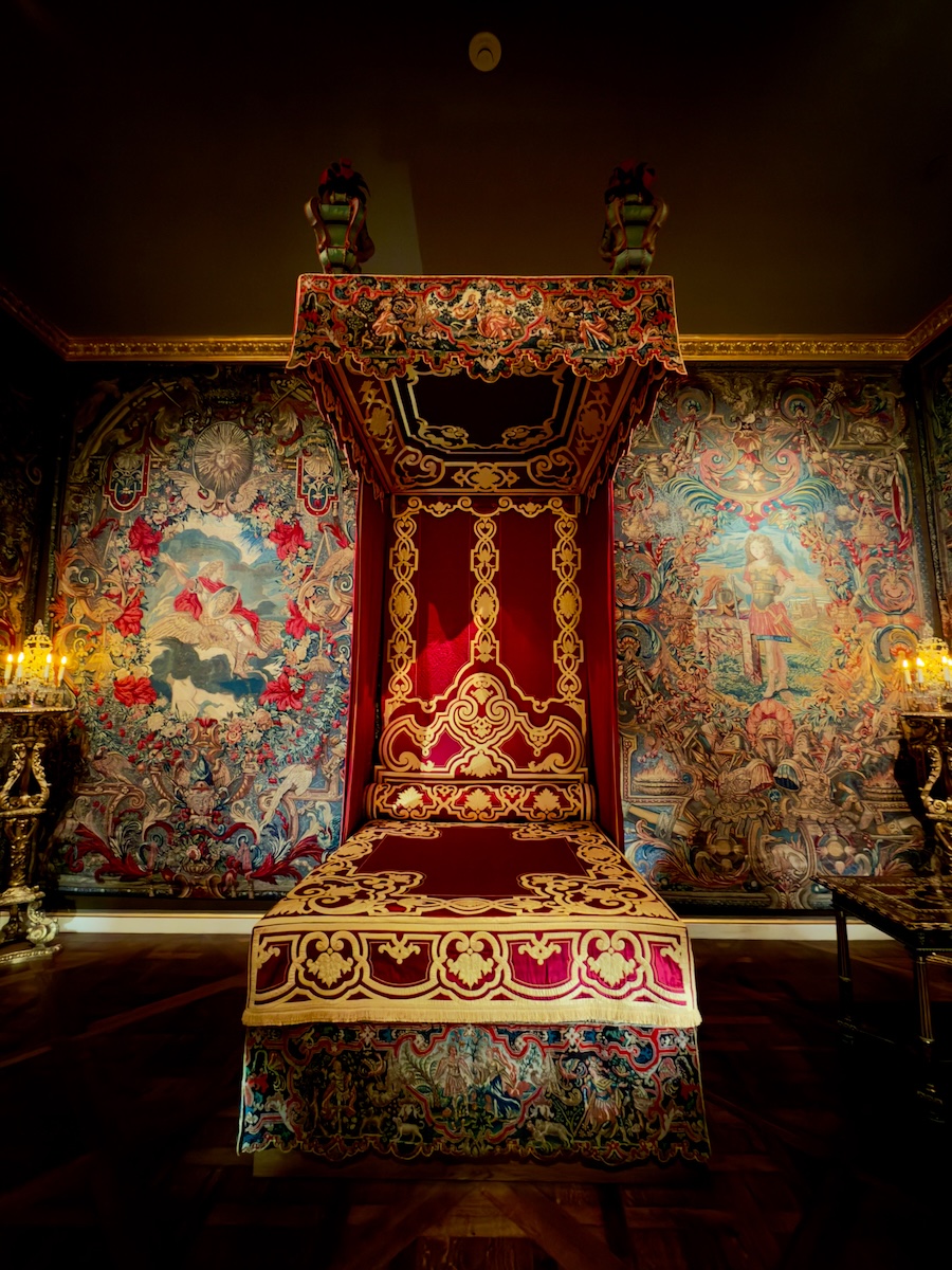

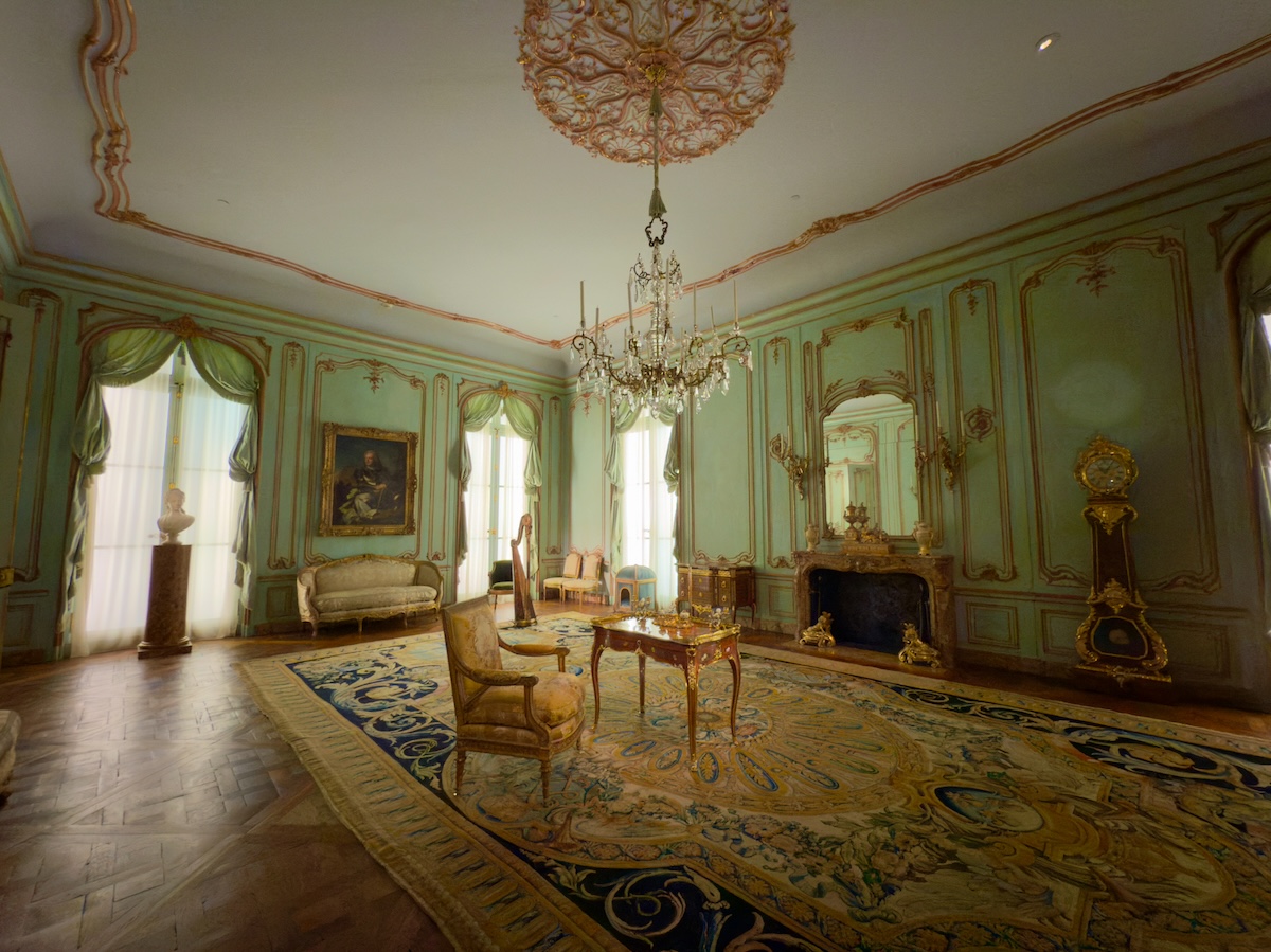
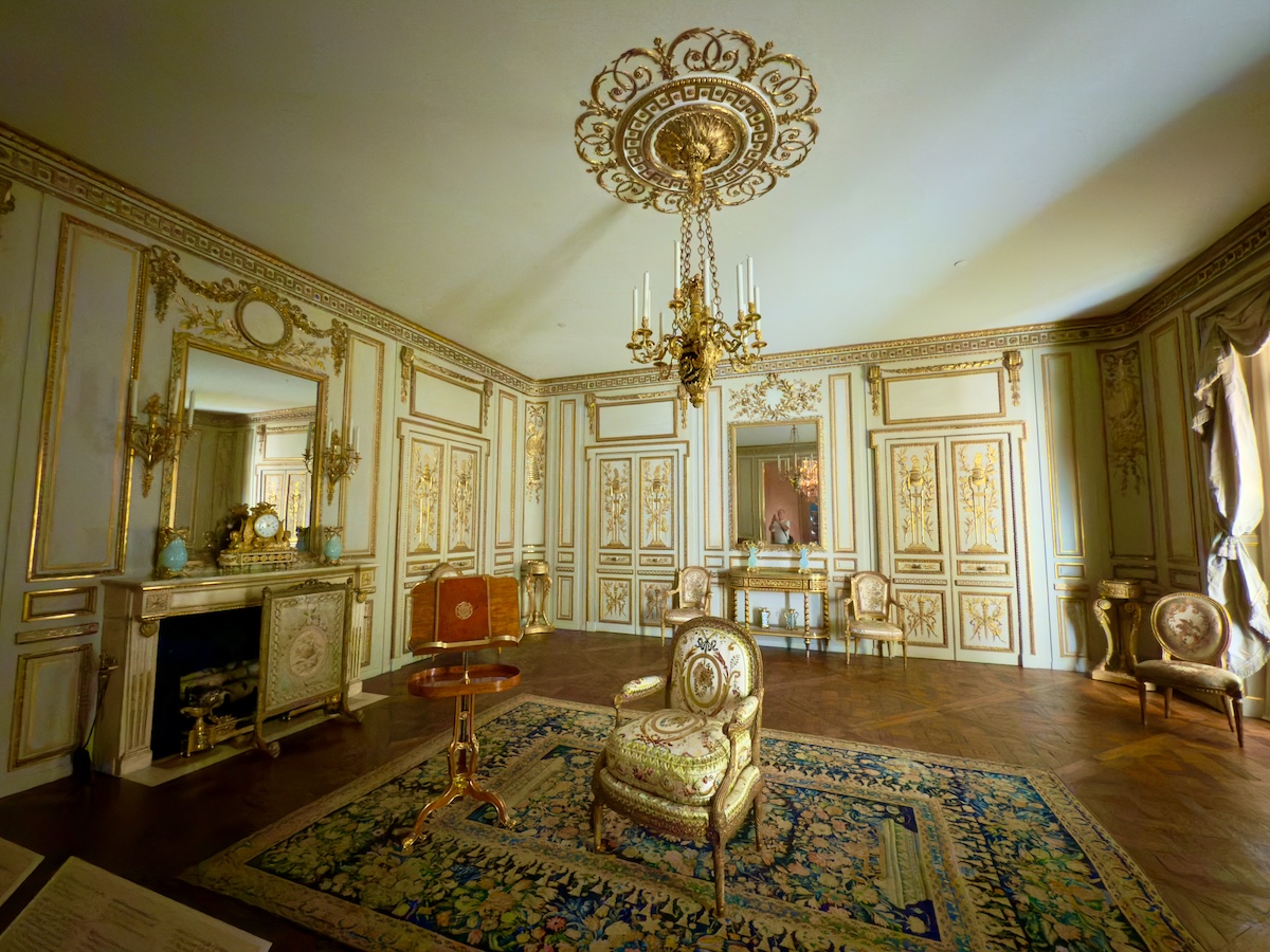
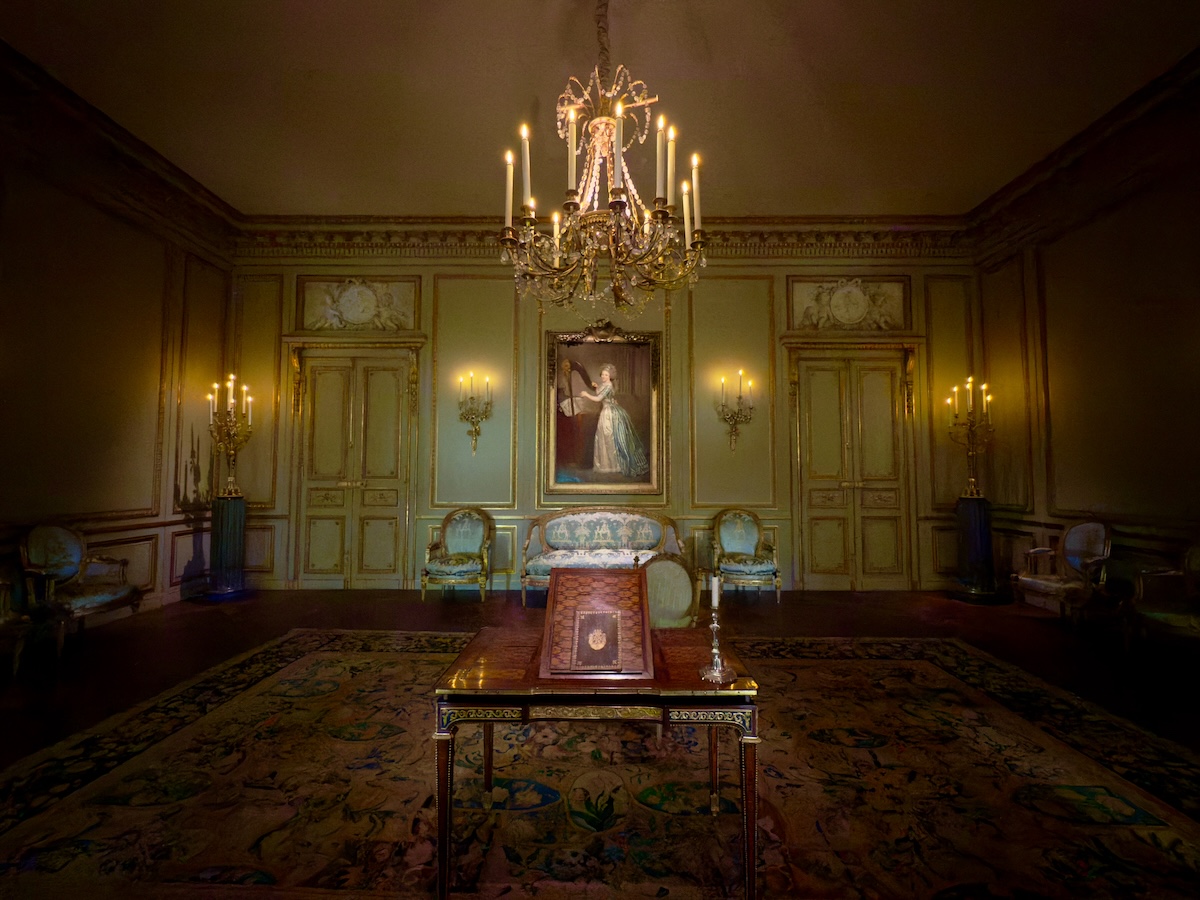

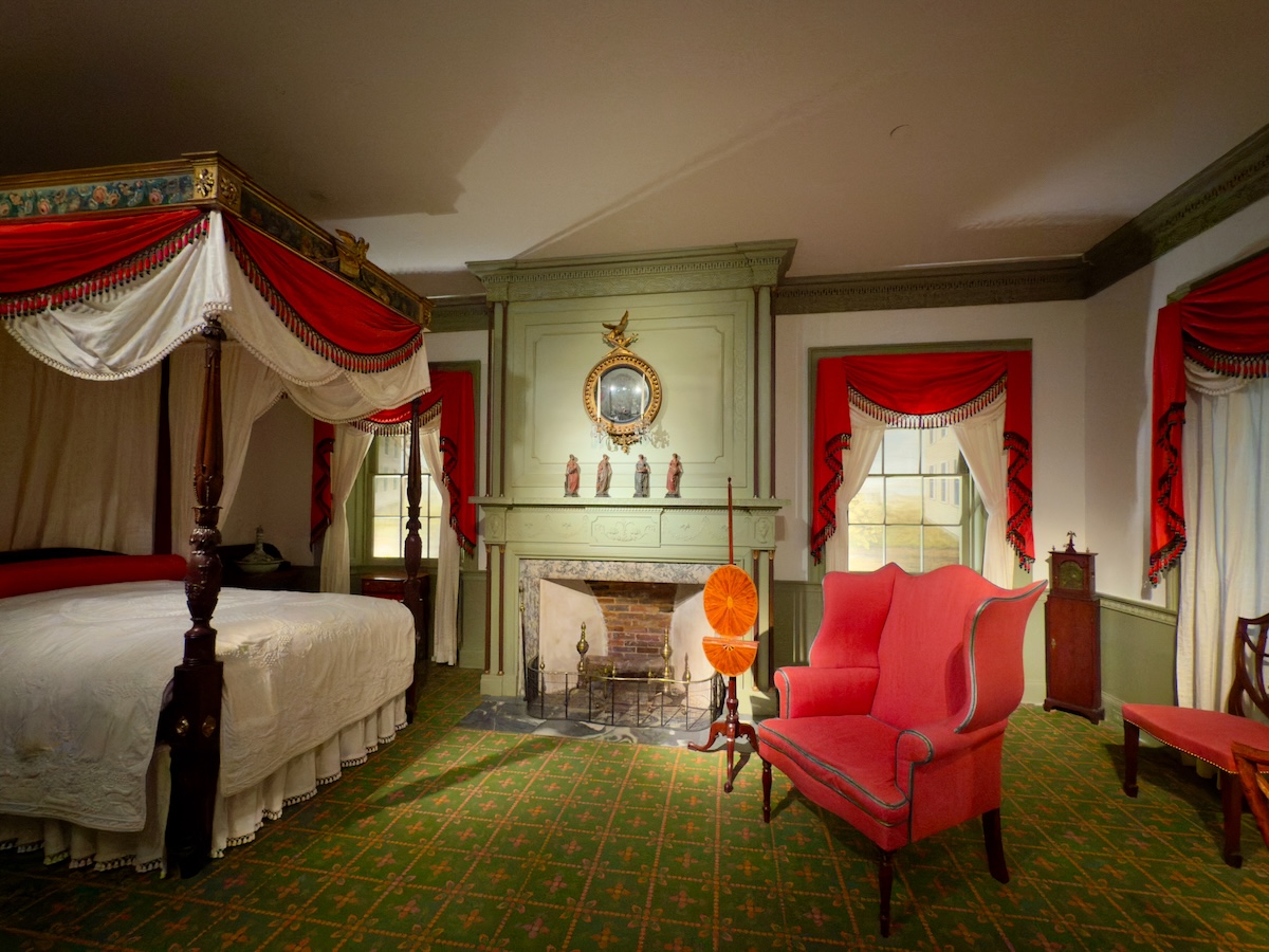
Reconstructed Rooms (Period Interiors), 18th–19th century – Various
The Met doesn’t just collect objects—it collects entire environments, then seals them behind glass. Bedrooms, salons, parlors—each carefully arranged and slightly unreal. You can’t enter these spaces, you can only peer into them like a well-funded historical dollhouse. One of them, improbably, comes from Haverhill, Massachusetts, which felt closer to home than expected.
A Bedroom in Bernstorff Palace near Copenhagen, c. 1845 – Johan Vilhelm Gertner
A quieter version of the same idea, but flattened into a two-dimensional painting. The entire room is filtered through soft pink light, edges softened just enough to feel slightly out of reach. It looks calm at first, then a little staged, like a room waiting for someone who never quite arrives.


Plaque depicting Bernard Palissy, 1846 – Sèvres Manufactory
A small domestic crisis rendered with full historical drama—Palissy burning his own furniture to keep the kiln going. There’s something admirable about the commitment, right up until you remember this is a man solving a work problem by setting his house on fire. The frame, meanwhile, refuses to calm down about any of it.
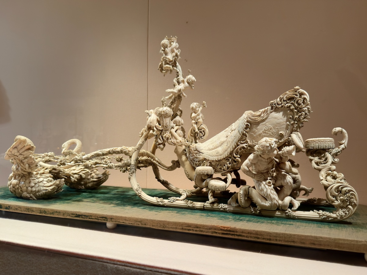
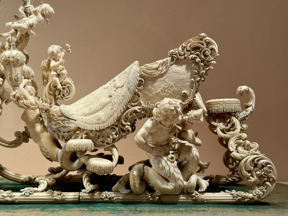
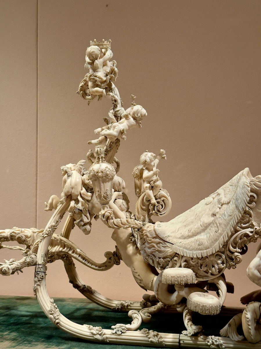
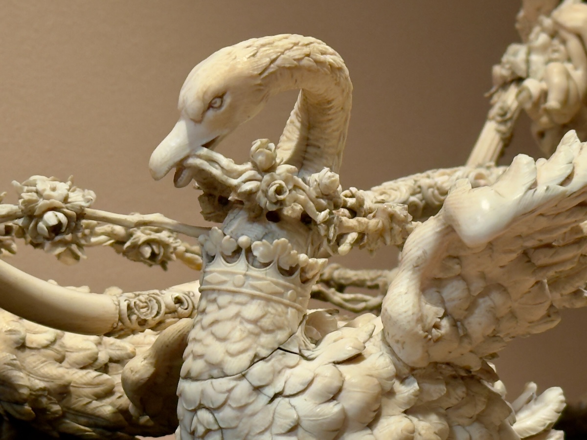
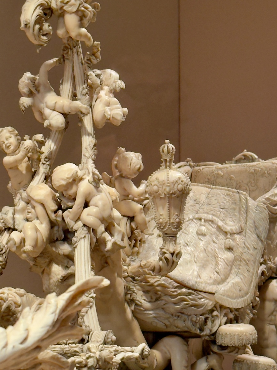
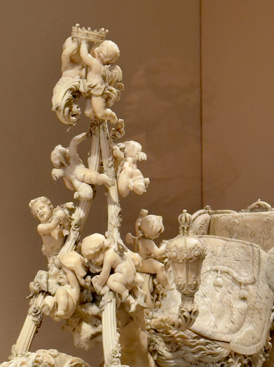
Model of King Ludwig II of Bavaria’s Neo-Rococo Sleigh, 1872–1880 – Franz Seitz
A sleigh that looks like it was designed without much concern for snow, steering, or even basic physics. Swans instead of horses, elaborate carving everywhere, and the strong sense that this existed mainly so someone could make an entrance at night. It feels less like transportation and more like a very expensive decision.


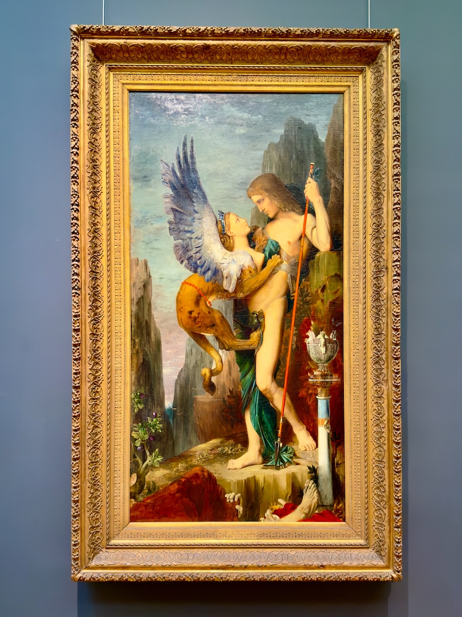
Oedipus and the Sphinx, 1864 – Gustave Moreau
You don't need to know the riddle to understand that this is not going well. The Sphinx is fully committed, Oedipus is holding his ground, and the remains in the foreground suggest there's a pretty firm grading curve. It's all very composed for a situation with such a high failure rate.
Salomé, 1870 – Henri Regnault
We recognized this one immediately from the opening credits of What We Do in the Shadows, which is not how you expect to meet a biblical figure. The familiarity wears off pretty quickly, though. The pose is controlled, the setting is rich, and the tray in her lap quietly clarifies how this story ends.

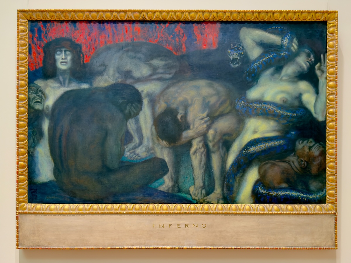
Inferno, 1908 – Franz von Stuck
A Dante reference that skips the slow build and goes straight to the problem. The color is doing a lot, the figures are doing more, and none of it is all that subtle. You could spend time unpacking the symbolism, but the overall message comes through immediately and doesn’t feel particularly negotiable.
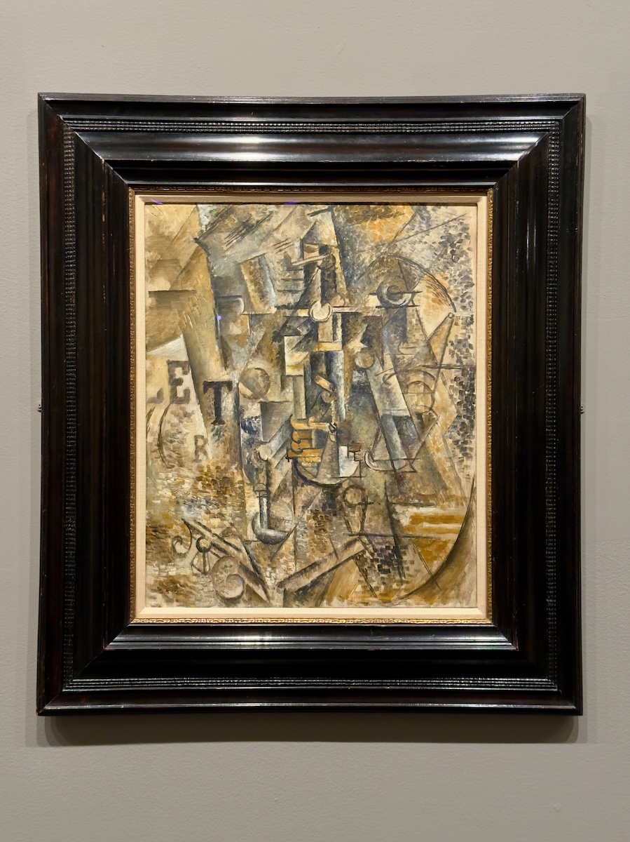
Still Life with a Bottle of Rum, 1911 – Pablo Picasso
Yes, Picasso makes the list, but this one felt earned. Once you start picking out the pieces—the bottle, the glass, the pipe—it comes together slowly, like a puzzle you don’t mind taking your time with. Also, anything that quietly suggests happy hour commands our full attention.
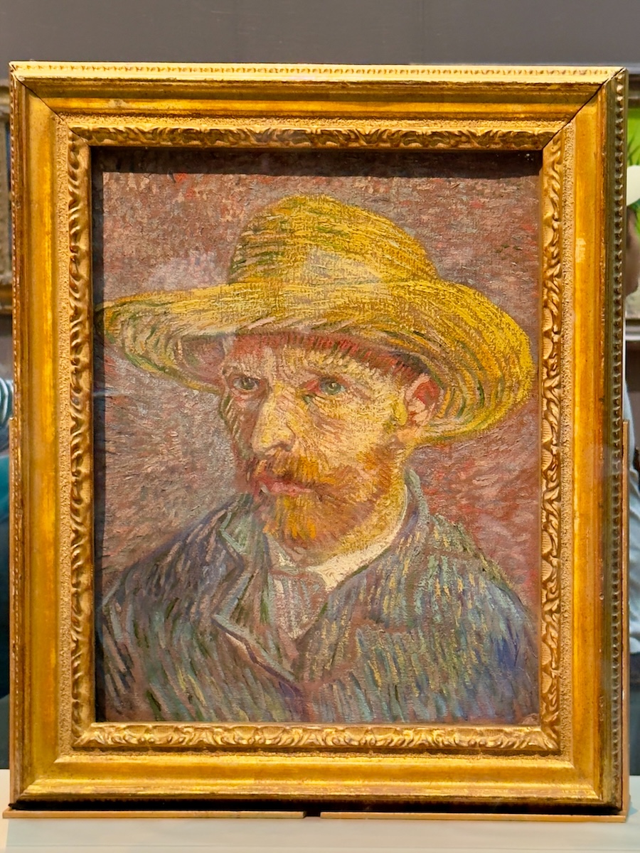
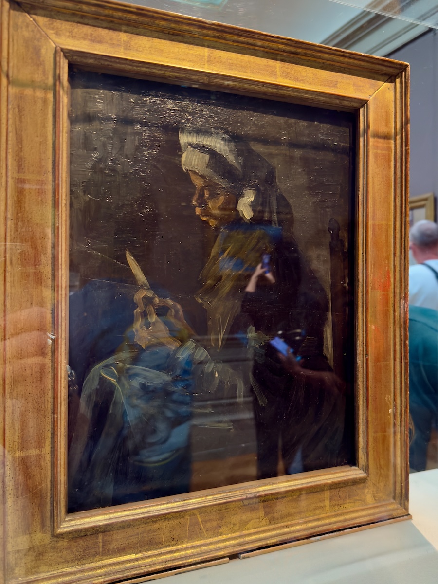
Self-Portrait with a Straw Hat (obverse: The Potato Peeler), 1887 – Vincent van Gogh
The front is what draws you in, but the back is what sticks. Seeing both sides of the same canvas shifts it from “finished painting” to “working surface,” which somehow makes it feel more immediate. Also, finding out there’s a whole second painting hiding behind it feels a little like catching the museum off guard. Like our entry fee was worth it.
Special Exhibition – Sargent in Paris
Sargent is one of those artists we thought we knew going in. Elegant portraits, society people, a lot of very assured brushwork. This show focuses on his early years in Paris, when he was building a reputation and testing how far he could push things before people started to object. Which, as it turns out, didn’t take long.
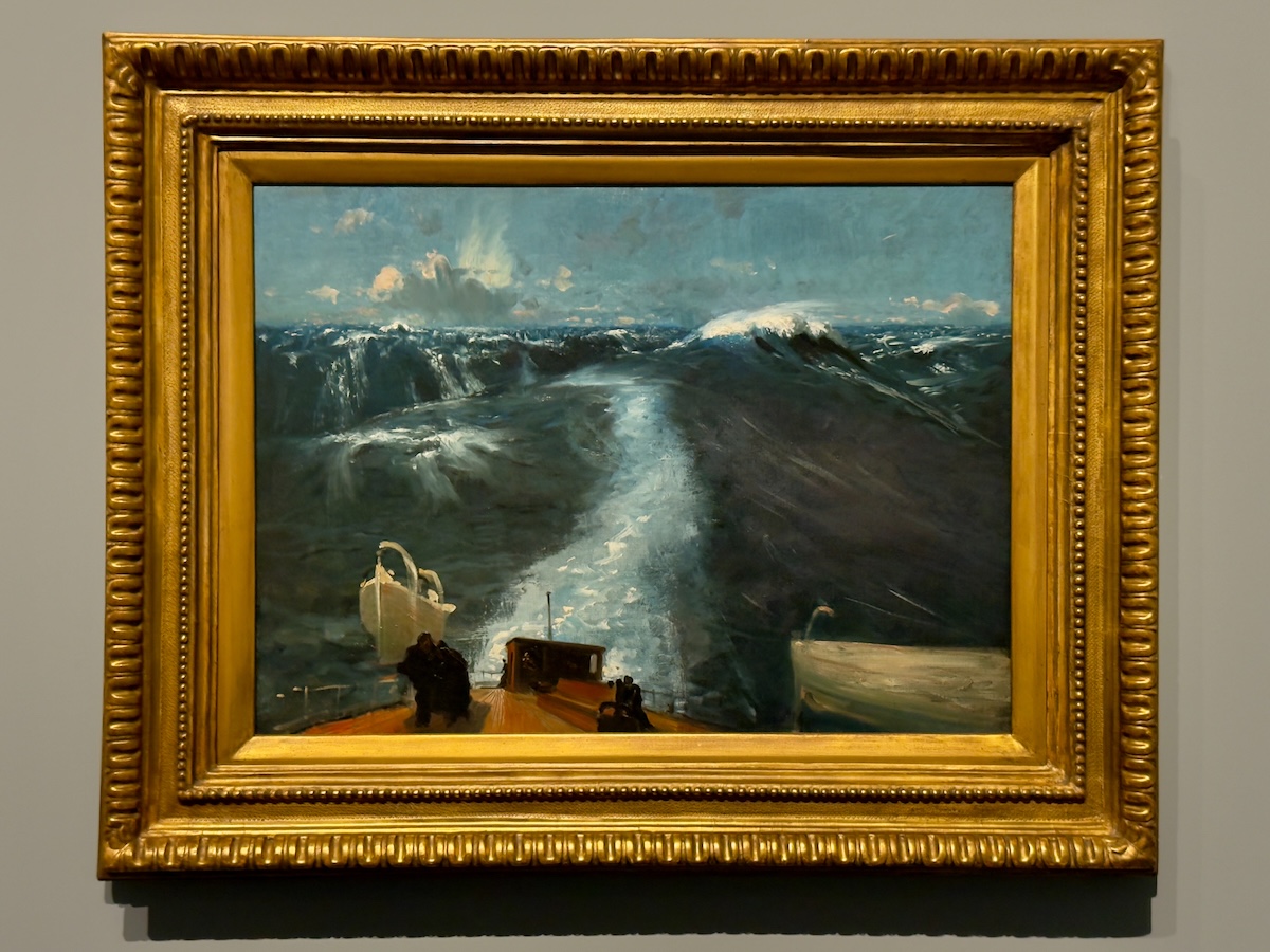
Atlantic Storm, 1876
You can feel him figuring things out in real time—how far he can tilt the world before it breaks. The deck is at a frankly unreasonable angle, the horizon barely behaving, and the whole thing feels one bad decision away from going sideways. It’s less about the storm itself and more about discovering he can paint something this unstable and make it hold.
Edouard and Marie-Louise Pailleron, 1881
Marie-Louise, the younger of the two, reportedly put Sargent through 83 sittings for this one, which makes sense when you look at her. That stare isn’t cooperating with anything, and Sargent clearly decided not to fight it. The whole painting has the uncomfortable energy of a standoff that was never really resolved. It’s technically polished, sure—but the feeling you’re left with is that nobody won.


The Daughters of Edward Darley Boit, 1882
Four children, one enormous room, and a surprising amount of distance between all of them. The space does most of the talking—those vases, the shadows, the corners you can’t quite see into. It looks like a formal portrait at first, but then things start to slip. This one is often described as unconventional, which feels like a euphemism.
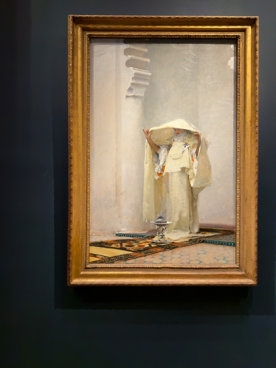
Fumée d’Ambre Gris (Smoke of Ambergris), 1880
This is doing a lot of work to look effortless. The whites stack on top of each other—fabric, wall, light—until you realize how carefully it's all been engineered. It's supposed to feel atmospheric, mysterious, maybe even a little transportive. It also feels like Sargent is proving he can control an entire room using almost nothing at all.
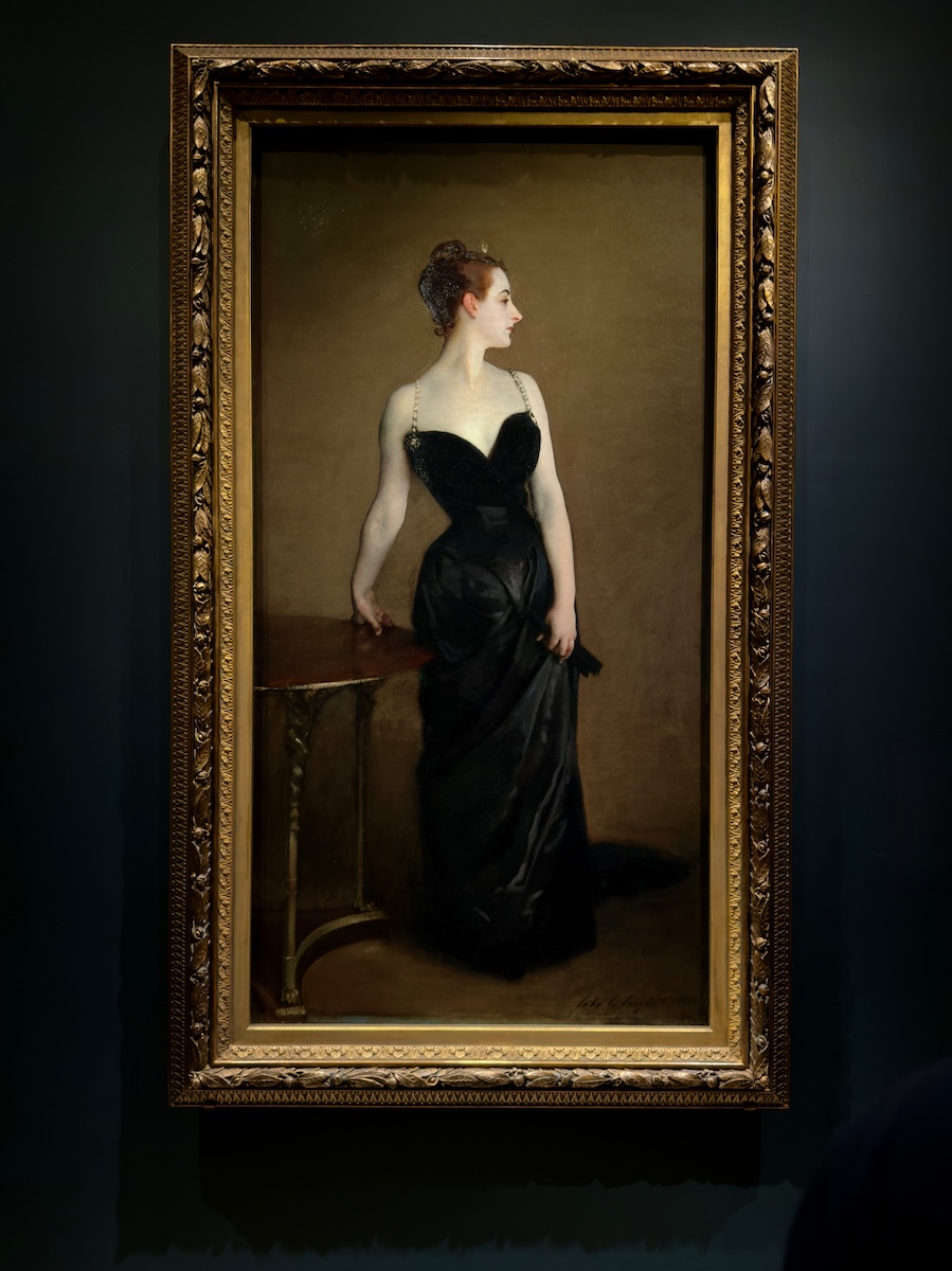
Portrait of Madame Pierre Gautreau (Madame X), 1883–1884
The skin is the first thing you notice—and then you realize you’re not supposed to be entirely comfortable with it. That cool, almost greenish cast pushes her out of “person” and into something closer to sculpture. She’s composed, controlled, and just a little unreal, like she knows exactly how she’s being seen and has decided that’s all that matters.
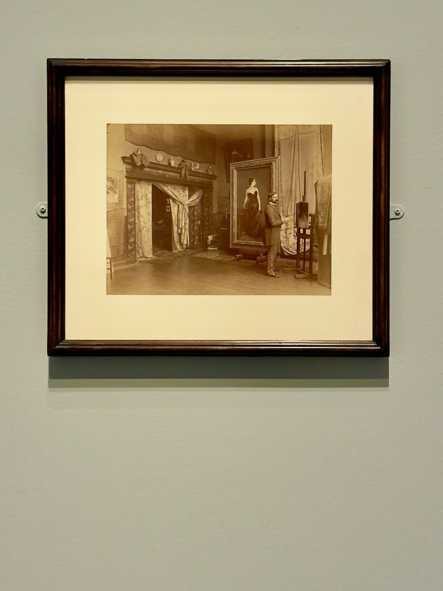
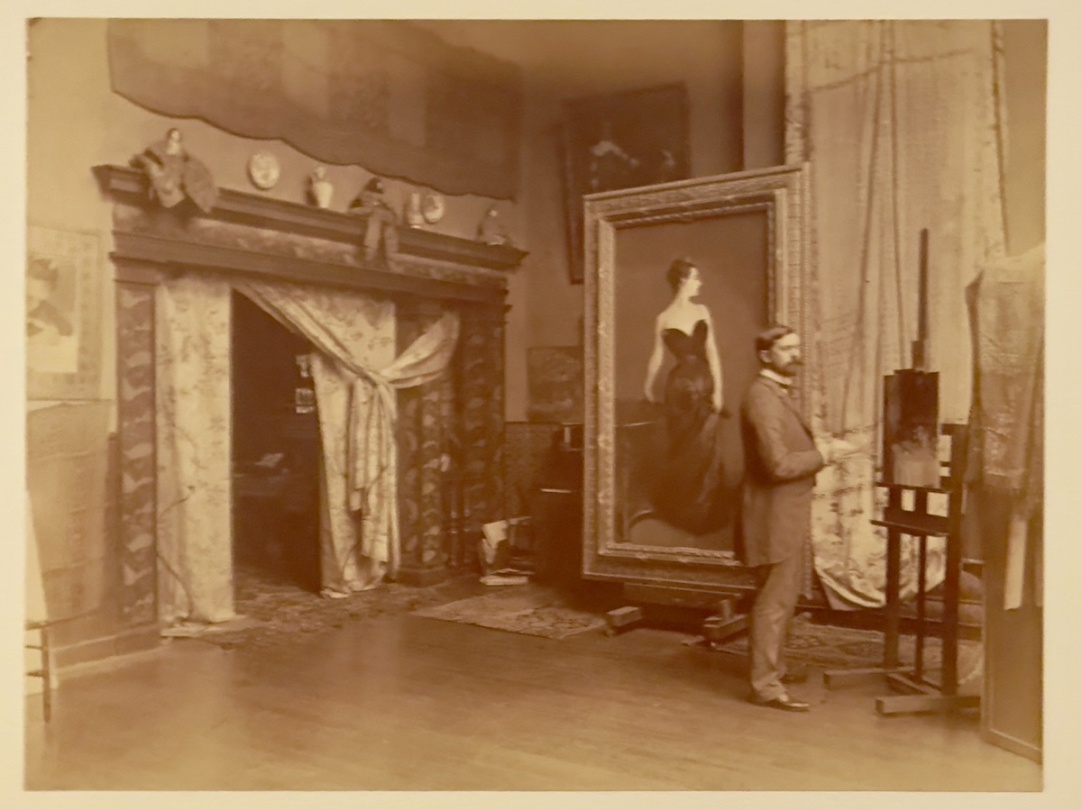
John Singer Sargent in His Studio with the Painting of Madame X, c. 1884 — Adolphe Giraudon
This is the part you don't usually get—the painting mid-controversy, still living its regular life in a studio. The strap is fixed, damage control is underway, and Sargent looks…fine. Maybe even a little defiant. It's a good reminder that what feels scandalous in the moment can eventually become just another museum label.
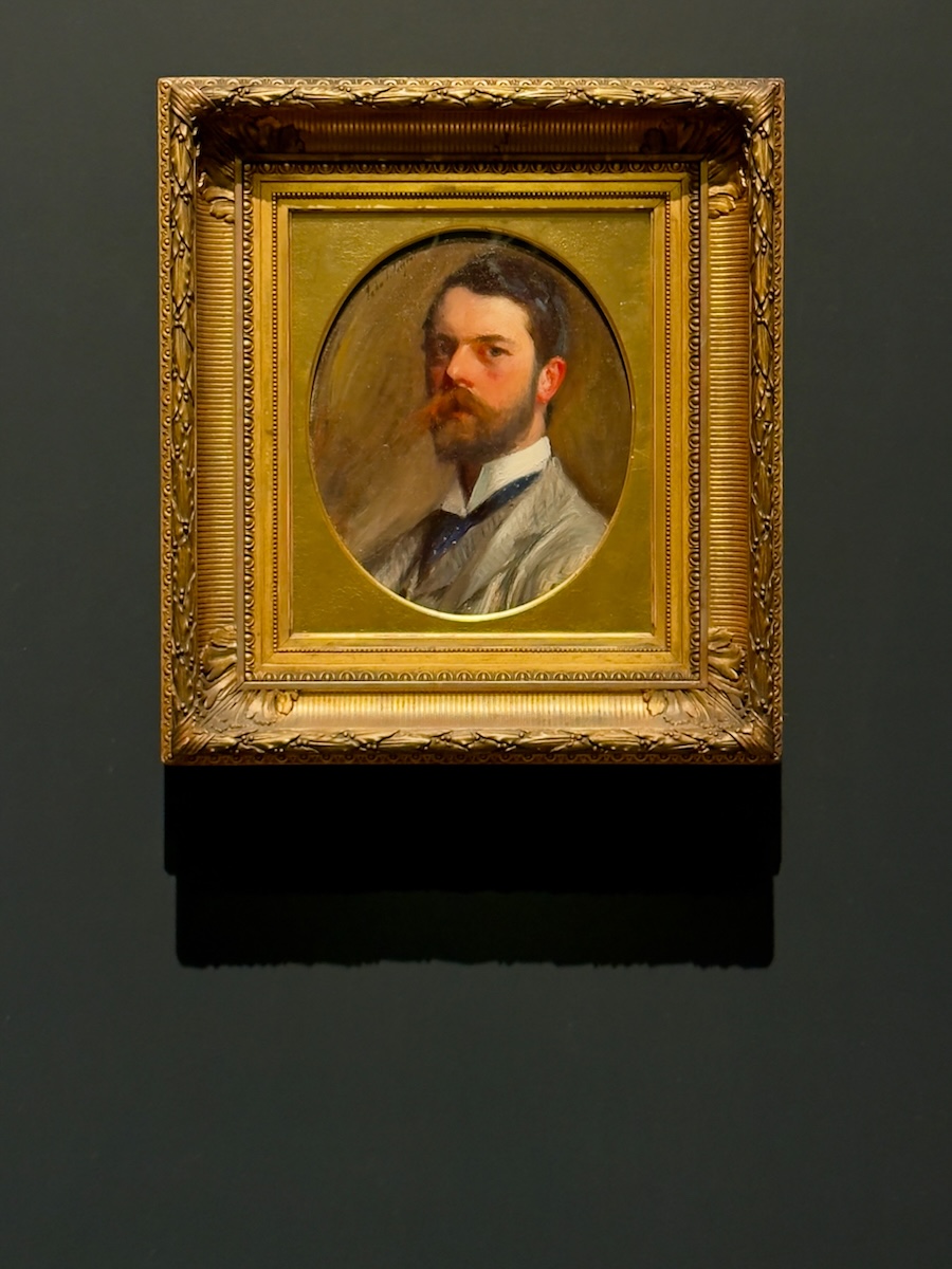
Self-Portrait, 1886
Thirty years old and already painting himself like someone with a reputation to manage. It’s controlled, deliberate, and just guarded enough to keep you at arm’s length. You can see the confidence, but also the calculation—what to show, what to hold back. Henry James was wondering what he’d do next. Sargent looks like he already had a pretty good idea.
Somewhere between a 19th-century French boudoir and an entire Egyptian temple, the Met stops pretending it’s anything other than curated chaos. You don’t leave with a single clear impression—you leave with fragments. And a sneaking suspicion that the fragments are the whole point.
Write a comment